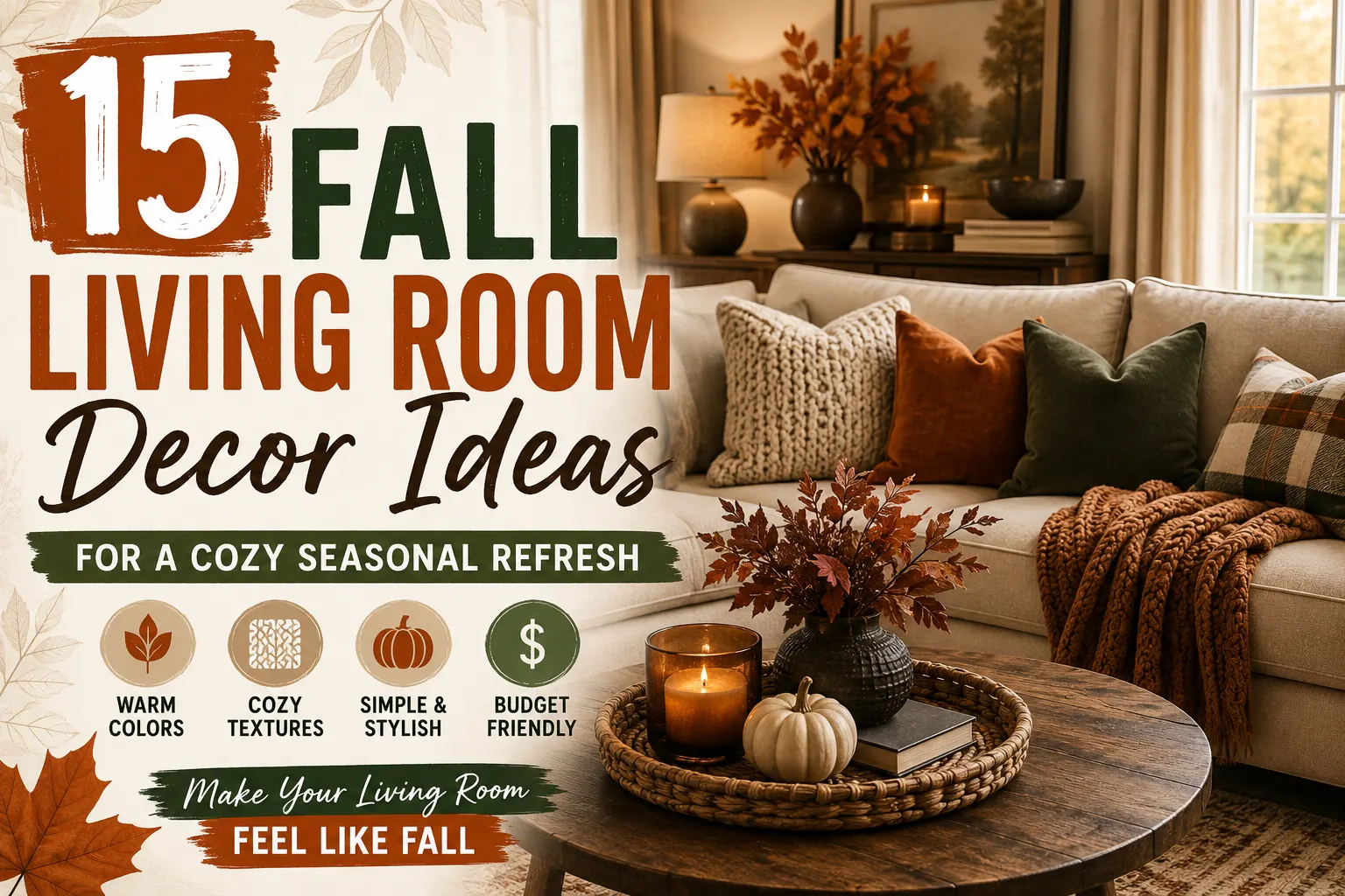
15 Fall Living Room Decor Ideas for a Cozy Seasonal Refresh
A living room doesn’t need a full makeover to feel like fall. Most of the seasonal shift comes down to four things: texture, color, lighting, and a handful of natural materials placed with intention — not a bin of themed decor from the seasonal aisle.
If you’ve already read our cozy living room styling guide, you know the same rule applies year-round: fewer, better-chosen pieces beat a room packed with knickknacks. Fall decorating is really that principle applied to one season.
This guide walks through 15 practical updates, how to make them look intentional instead of cluttered, and how to adapt everything for a small apartment or a tight budget. Every idea here answers one question: does this actually make the room feel better, or does it just add stuff?
The fastest way to make a living room feel like fall is to swap textiles (pillow covers, one throw), pick a single warm color palette (like rust, cream, and brown), layer in warm lighting, and add one or two natural touches like branches or neutral pumpkins. Skip themed decor and keep your existing furniture as-is — the room only needs 3-4 small changes, not a full redecorate.
How to Transition Your Living Room from Summer to Fall
Keep the existing neutral foundation. Your sofa, rug, curtains, and larger furniture are already doing the heavy lifting. A fall refresh works with them, not against them — swapping out the whole room every season is expensive and unnecessary when the furniture is neutral for exactly this reason.
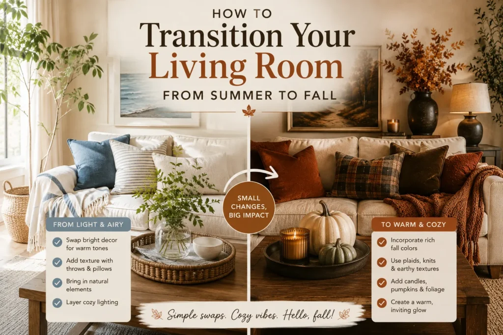
Remove bright summer accents first. Before adding anything new, do a lap around the room and pull the tropical prints, bright florals, and lightweight textures that still read as warm-weather. This step matters more than people think. A room can’t feel cozy while it’s still visually competing with citrus-colored pillows from July.
Choose one simple fall color palette. Color psychology backs this up — warm, muted tones like rust and olive read as enclosed and comforting, while brighter or cooler tones read as open and fresh. That’s the whole reason fall palettes lean warm. Pick one combination and use it throughout the room instead of mixing two or three:
- ✓
Rust, cream, and brown
- ✓
Olive, beige, and natural wood
- ✓
Terracotta, linen, and brass
- ✓
Camel, warm white, and walnut
A single palette gives the eye somewhere to rest. Mixing several “fall-ish” palettes at once is one of the fastest ways to make a room look busy instead of styled — and it’s the single biggest difference between the rooms that look pulled-together and the ones that look like a decor aisle exploded.
Test your palette against your existing rug and sofa before buying anything. Hold a fabric swatch or paint chip up in the room at different times of day — a rust that looks rich in the store can read muddy under warm bulb lighting. Five minutes of checking saves a return trip.
If you want a broader room-by-room version of this same seasonal transition, our early fall home decor guide covers the process for the whole house, not just the living room.
15 Refreshing Fall Living Room Decor Ideas for 2026
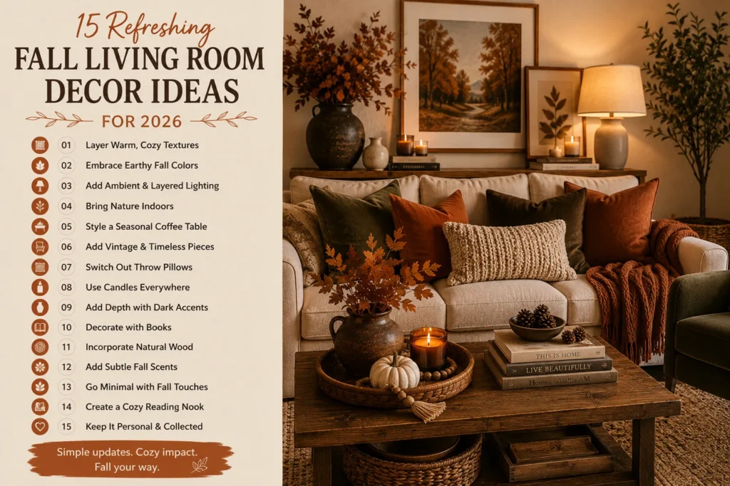
1. Replace summer pillow covers — not the inserts, and not more than 3-4 total
Keep your existing pillow inserts and swap only the covers, in two or three fall shades that pull from your sofa’s undertone (a gray sofa with cool undertones, for example, pairs better with olive or rust than with orange-leaning terracotta).
For a standard 3-seat sofa, 3-4 pillows is the ceiling — two 20″ covers in your main color plus one or two 18″ covers in a textured accent (bouclé or corduroy) reads as styled. Five or more starts to look like you’re stockpiling for winter. Because you’re only buying covers, this is usually a $30-60 refresh, not a $200 one.
2. Layer exactly one throw, and drape it — don’t fold it flat
A single throw, draped diagonally over one arm of the sofa or tossed loosely over the back of an accent chair, does more than three throws stacked and folded on the couch. The trick is the drape itself: let one corner hang lower than the other instead of folding it into a neat rectangle.
A flat-folded throw reads as “unused decoration”; a loosely draped one reads as “someone actually uses this room.” Chunky knit or waffle-weave throws hold a drape better than thin fleece, which tends to slide flat.
3. Mix exactly three textures, no more — and put the roughest one closest to the room’s entry point
Pick 3 from this list: linen, velvet, wool, bouclé, or a woven natural fiber like jute or rattan. Distribute them across your pillows, throw, and rug rather than concentrating all three on one item. A practical starting combo: a bouclé lumbar pillow, a chunky wool throw, and your existing jute or sisal rug underneath. Four or more textures in one seating area starts to look chaotic rather than layered — three is the number that reads as “curated” instead of “collected.”
4. Style your coffee table using this exact 5 piece formula
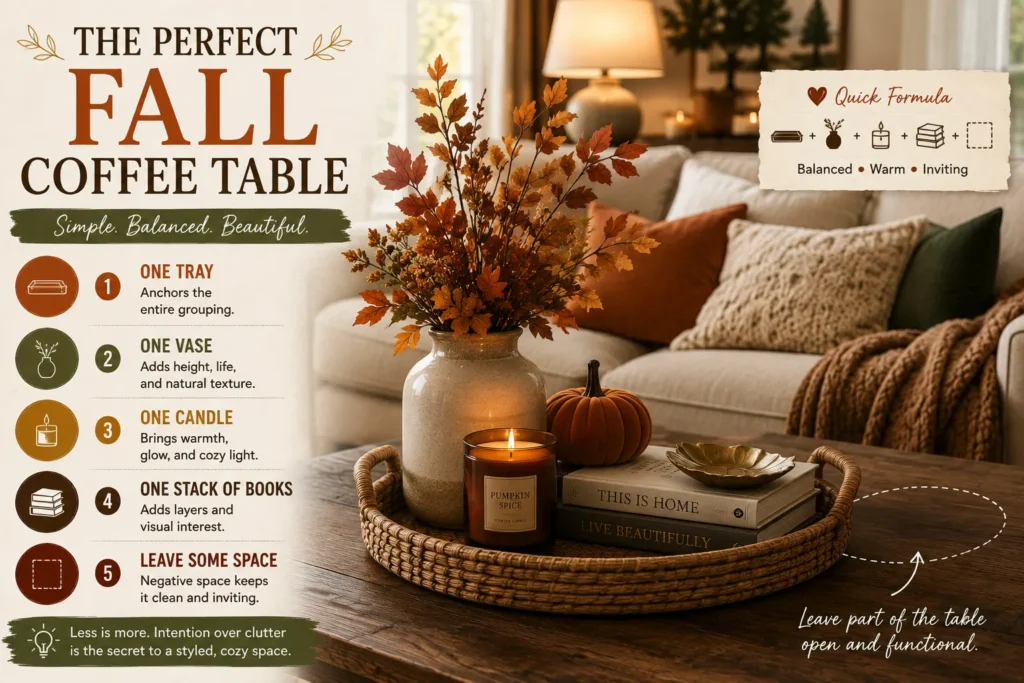
Coffee tables get over-decorated more than any other surface in the house. Use a formula instead of improvising:
- ✓
One tray (wood or woven, roughly two-thirds the width of the table) to anchor everything else
- ✓
One vase or branch arrangement, taller than everything else on the table, placed toward the back or one side — never dead center
- ✓
One candle, ideally in an amber glass or ceramic holder to echo your color palette
- ✓
One stack of books, spine-out or spine-in depending on whether the covers or the pages look better in your palette
- ✓
Deliberately empty space — leave roughly a third of the table bare
Arrange the tray, vase, and candle at staggered heights rather than in a straight line, and keep everything within the tray’s footprint except the book stack. That containment is what makes the grouping look intentional instead of scattered.
Group items in odd numbers and vary their height (tall vase, mid-height candle, flat stack of books). Odd-numbered, uneven-height groupings are what stylists use to make a small vignette look deliberate instead of just “placed there.”
5. Replace bright florals with one branch arrangement, sized to the vase
Swap any summer floral arrangement for dried grasses, eucalyptus stems, olive branches, or pampas grass — but size the arrangement to roughly 1.5 times the height of the vase itself; anything shorter looks stubby, anything much taller starts to look top-heavy.
3 to 5 stems is usually enough for a standard 10-14″ vase. Because dried branches don’t wilt, this is genuinely a one-time purchase that lasts the entire season and often into winter, unlike fresh flowers that need replacing every one to two weeks.
6. Pick exactly one focal point and commit your entire budget and effort to it
Choose a single area — the mantel, the media console, the coffee table, or the sofa — and do 80% of your styling work there, leaving the rest of the room close to untouched. This is the single hardest piece of advice on this list to actually follow, because the instinct is to spread a little decor everywhere.
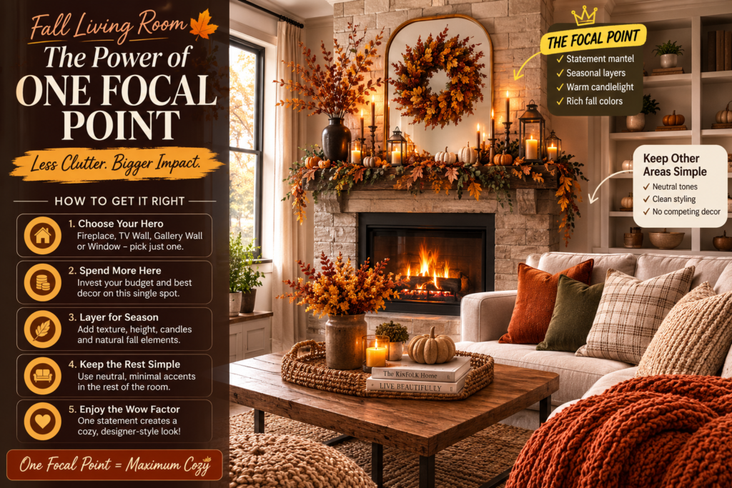
Resist it. A room with one genuinely well-styled area and three plain ones reads as designed; a room with five half-decorated areas reads as cluttered no matter how nice the individual pieces are.
7. Style the mantel or console in three visual layers, back to front
Work in layers by depth, not just by height:
- ✓
One tray: artwork, a mirror, or a large piece of framed art leaning against the wall
- ✓
One vase or branch arrangement: candles (in a cluster of 2-3, varying heights) or a greenery garland draped loosely along the surface
- ✓
One candle: one seasonal accent — a small pumpkin, a stack of 2 books, or a single dried branch in a low vase
Keep each layer roughly 2-3 inches shorter than the one behind it, so nothing blocks the layer behind it from view. A flat row of same-height objects reads as a shelf display; three staggered layers read as a styled vignette.
8. Add warm wood and woven pieces in at least 2 different finishes
One wooden bowl and one rattan basket, in two different wood tones (say, a lighter oak tray next to a darker walnut bowl), read as more intentional than matching everything to the same wood finish.
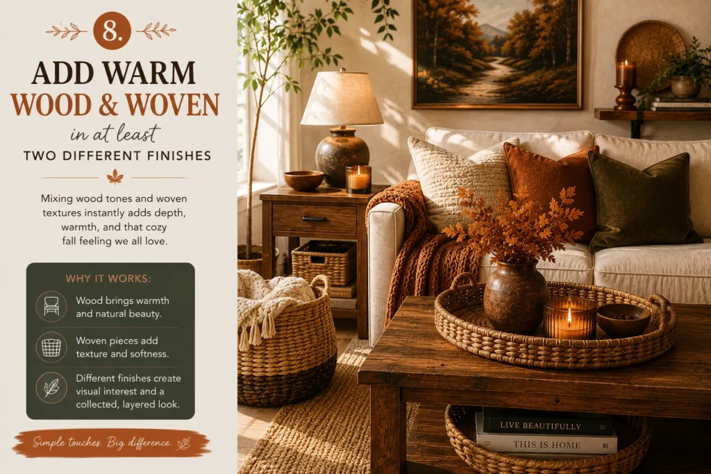
Mismatched-but-coordinated wood tones are how professionally styled rooms avoid looking like a matched furniture set. These pieces also earn their keep past fall — a wood tray or rattan basket works in a spring or summer room just as easily, so it’s not a single-season purchase.
9. Repeat amber glass or earth-tone ceramic in exactly 3 spots
Pick one material — amber glass or a specific ceramic glaze color — and place it in three separate locations: for example, an amber glass vase on the coffee table, a matching amber candle holder on the console, and a small amber glass bowl on a side table.
Three repetitions is enough for the eye to register a pattern; one or two reads as coincidence, and five or more starts to feel matchy rather than coordinated. This repetition is what design books call “visual rhythm” — it’s the concrete mechanism behind a room feeling “put together.”
10. Layer three light sources at three different heights
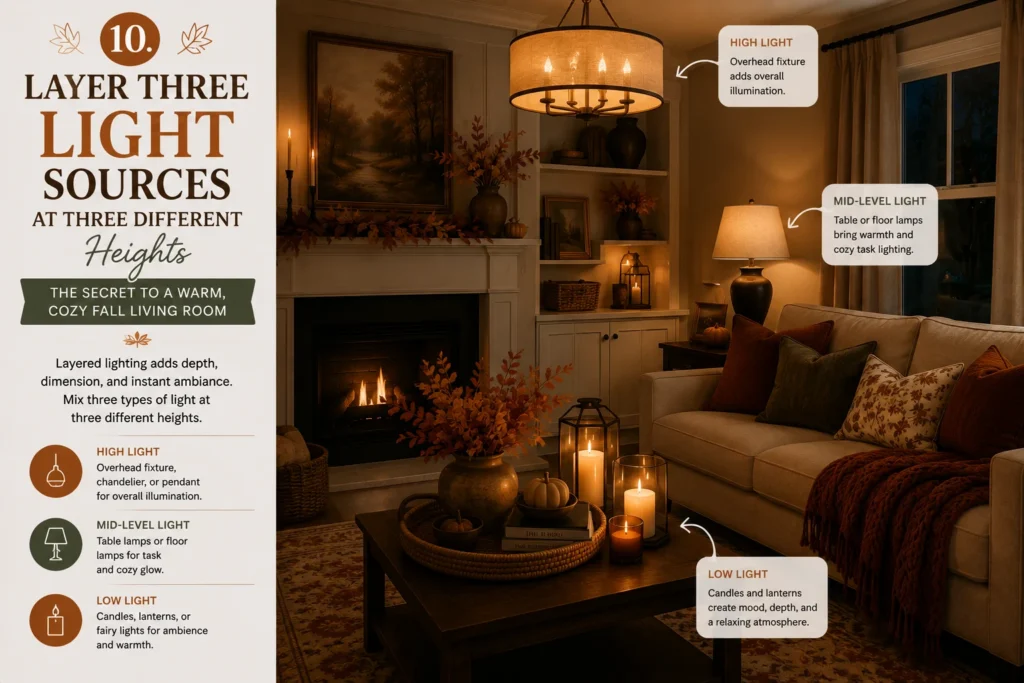
Combine a floor lamp (light at standing height), a table lamp (light at seated eye-level), and 2-3 candles (light near table height) in the same seating area. Turn off the overhead light entirely in the evening and rely on these three instead. The height variation matters as much as the light itself — three lamps at the same height still reads as flat, while light sources at three different heights create the layered shadow that makes a room feel enclosed and warm rather than lit like an office.
Check your bulb temperature, not just the lamp itself. Look for bulbs labeled “soft white” or 2700K-3000K — anything higher (4000K+) reads as clinical, office-style light and will fight against every other warm choice you’ve made in the room.
11. Build a reading corner using exactly four elements — no more
Pick one chair (an accent chair, not the sofa) and add exactly four things: a throw draped over one arm, a small side table within reach, a lamp on that table, and one seasonal accent (a candle or a small stack of books).
4 elements is enough to make the corner feel deliberate without turning it into its own separate decorating project. Position the chair at a slight angle to the rest of the room, rather than facing straight into it, since that angle is what visually signals “this is a spot for one person to sit,” not just an extra chair in the layout.
12. Group pumpkins in threes, in neutral tones, all in one spot
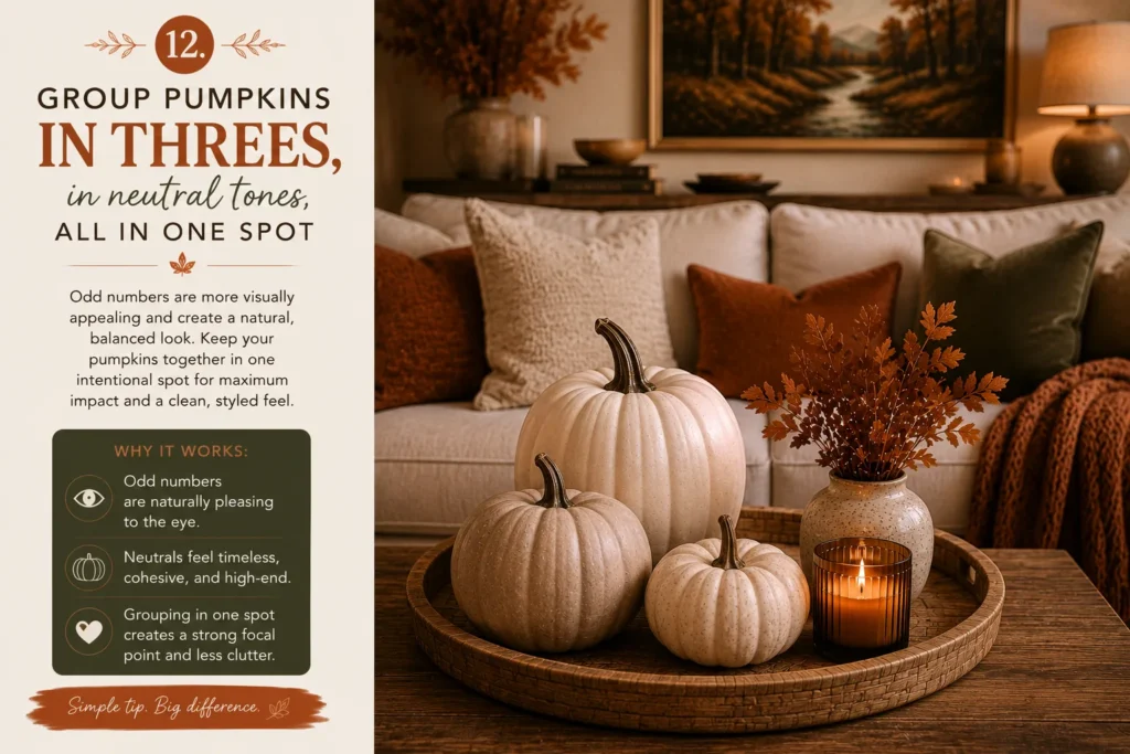
Buy 3 pumpkins in varying sizes (small, medium, large) in white, sage, or natural tan rather than traditional orange, and cluster them together in a single grouping — on the coffee table, the console, or a windowsill — rather than distributing single pumpkins around the room. Vary the sizes so no two are identical; a matched set of three identical pumpkins reads as less natural than a mismatched trio. This single grouping is almost always more effective than eight pumpkins spread across the whole room.
13. Refresh wall art with pieces that share your fall palette’s undertone
Swap out bright summer prints for landscapes, botanical line drawings, vintage sketches, or warm abstract art — but check the undertone against your chosen fall palette before buying. A rust-and-cream palette pairs with warm-toned art (ochre, terracotta, warm browns); an olive-and-walnut palette pairs better with cooler, muted greens and browns.
Mismatched undertones between the art and the rest of the room are one of the most common reasons a “nice” piece of art still looks slightly off once it’s on the wall. Wall art is usually the single largest color block in the room after the furniture, so this one choice affects the room’s mood more than almost anything else on this list.
14. Use 2 – 3 baskets, sized for a specific job, not just for looks
Rather than buying decorative baskets, pick baskets sized to actually hold something: one large floor basket for extra throws, one medium basket for magazines or remotes, and optionally one small basket for coasters or candles.
A basket with a clear job disappears into the room’s function; a basket that’s purely decorative and empty often looks like exactly that. This is one of the only items on this list doing double duty as both texture and storage, which makes it one of the better value-per-dollar additions here. For more ways to stretch a decorating budget with dual-purpose pieces, our budget-friendly DIY decor roundup has 15 more ideas along the same lines.
15. Choose one fragrance, and place it at nose height, not on the floor
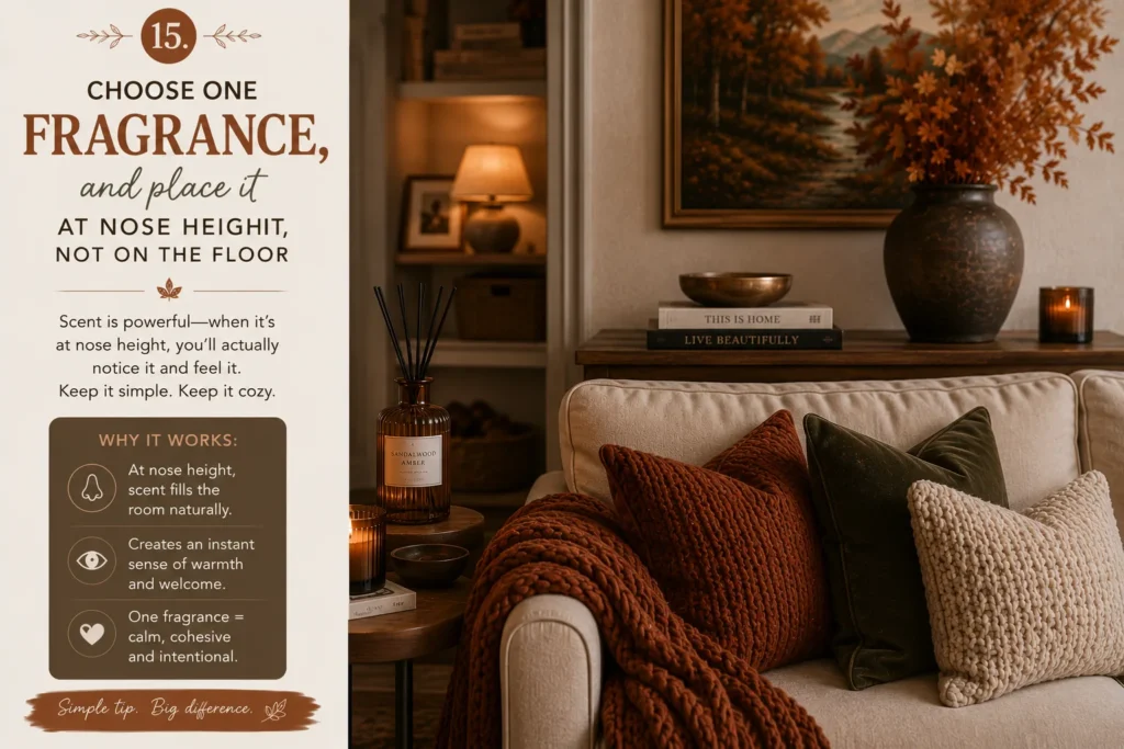
Pick a single scent — cedar, apple, sandalwood, fig, or cinnamon — and place the candle or diffuser on a table or shelf near seated eye level, not on the floor or a low surface, since scent disperses more noticeably from a slightly elevated point in a seating area. Running two or three different scents in the same room at once usually means they blend into something muddier than either scent alone, so resist the urge to double up even if you own multiple fall candles.
How to Make Fall Living Room Decor Look Expensive
Use fewer, larger pieces. One substantial vase, lamp, or basket reads as intentional. Five small trinkets read as clutter, even at a similar combined cost. Scale is one of the most underused tools in budget decorating — bigger, fewer pieces almost always look more expensive than many small ones.
Repeat the same materials. Wood, ceramic, brass, or amber glass, used in two or three spots around the room, creates the sense that the space was designed as a whole. It’s the same visual rhythm principle from idea 9, applied to the entire room instead of one grouping.
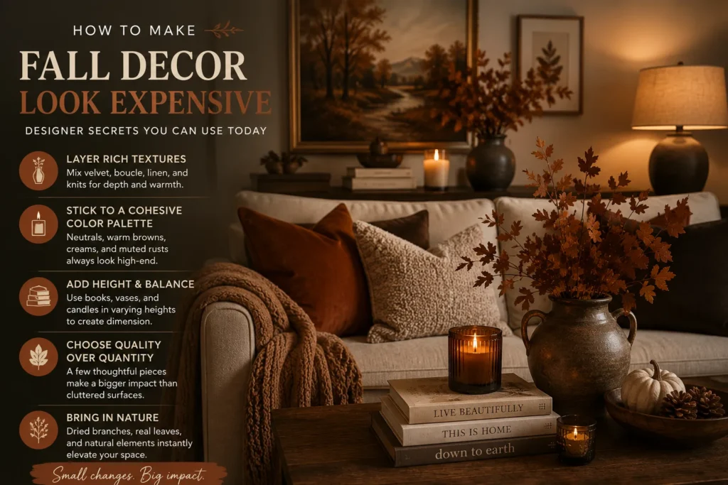
Limit the color palette. Two or three main seasonal colors, repeated consistently, will always look more polished than five colors competing for attention.
Leave empty space. Not every shelf, table, and corner needs something on it. Negative space is what lets the pieces you do have stand out instead of blending into visual noise.
Skip excessive novelty decor. Signs, slogans, artificial garlands, and brightly colored plastic decorations are the fastest way to make a room look like a seasonal retail display instead of a home. If a piece only works as a punchline, it’s probably not worth the shelf space.
Fall Living Room Decor for Small Spaces
Decorate one main zone. In a smaller room, pick a single zone — the sofa, the coffee table, or the console — rather than trying to touch every surface. Small spaces get visually noisy fast, so restraint matters even more here than in a larger room.
Choose decor that stores easily. Pillow covers, throws, candles, branches, and foldable textiles take up almost no storage space once the season ends, which matters if closet space is already tight.
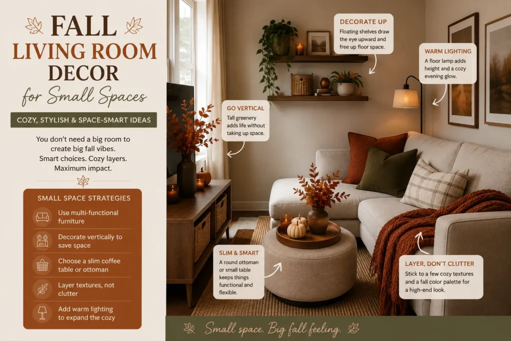
Avoid floor clutter. Use shelves, tables, and wall space instead of adding baskets or extra furniture to the floor. In a small room, floor space is your most valuable real estate — anything sitting on it should have a clear job.
Keep the palette light. Warm cream, beige, muted rust, or soft olive bring coziness without the visual weight of darker tones. Dark, saturated colors can make a small room feel like it’s closing in, so lighter warm tones are usually the better trade-off for square footage.
If you’re renting or short on storage, buy decor that does double duty for the next season too. A neutral wool throw or an amber glass vase works for fall and winter, so you’re not storing single-season items in a closet you don’t have.
Budget-Friendly Fall Living Room Refresh
Shop your home first. Baskets, vases, books, candles, and wooden accessories from other rooms can often fill in a fall display without spending anything. It’s worth doing this before any shopping trip — most people already own half of what a seasonal refresh needs.
Update covers instead of furniture. New pillow covers and a throw change the room’s feel for a fraction of what new seating or cushions would cost, and they store flat once the season’s over.
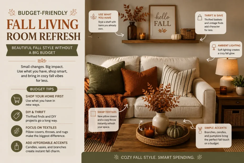
Use natural materials. Branches, dried grasses, pinecones, seasonal fruit, and leaves are inexpensive — often free — and bring in texture that manufactured decor can’t quite match.
Choose one affordable statement piece. Instead of many small purchases, put the budget toward one reusable item — a throw, a lamp, a vase, a basket, or a framed print. One good piece will outlast and outperform a handful of small ones, both in how the room looks and in how long it stays useful past the season.
Set your statement-piece budget before you shop, and treat everything else as a “shop your home” item only. This keeps the one splurge from turning into five smaller splurges that add up to more than the piece was worth.
If you enjoy the process of building pieces yourself rather than buying them, our DIY project skill-level guide is a good place to pick a project that matches how much time and experience you actually have.
Common Fall Decorating Mistakes
- ✓
Using too many fall colors at once
- ✓
Decorating every available surface instead of one focal point
- ✓
Adding too many small objects
- ✓
Making the room feel dark and heavy rather than warm
- ✓
Covering the sofa with too many pillows
- ✓
Mixing several unrelated decorating styles
- ✓
Blocking the television, fireplace, windows, or walkways
- ✓
Using more seasonal decor than everyday decor
Final Thought
Start with what the room already has. The furniture and color palette are doing more work than most people give them credit for. From there, update textiles, lighting, and natural elements before reaching for anything explicitly “seasonal.” Pick one or two areas to focus your effort on, and choose pieces that can reasonably stay out from early fall through Thanksgiving instead of decor that only works for a few weeks.
Frequently Asked Questions (FAQ)
Early-to-mid September works for most homes. It gives the decor time to feel relevant through Thanksgiving without competing with back-to-school season.
Lean on color palette, texture, and lighting instead. Warm pillow covers, a throw, layered lamps, and natural branches carry the seasonal feel without a single pumpkin in sight.
Rust, olive, and camel all pair well with gray or beige, since those neutrals are warm-cool enough to work with almost any accent color without clashing.
3 to 5, mixing sizes and one or two textures, is generally the sweet spot — enough to feel styled without making the sofa hard to actually sit on.
Focus on one zone, choose decor that stores flat or small, and keep the floor clear. Small spaces reward restraint more than any other room size.
Neutral pumpkins, branches, warm-toned textiles, and amber glass or ceramic pieces all transition into Thanksgiving decor without needing to be swapped out.