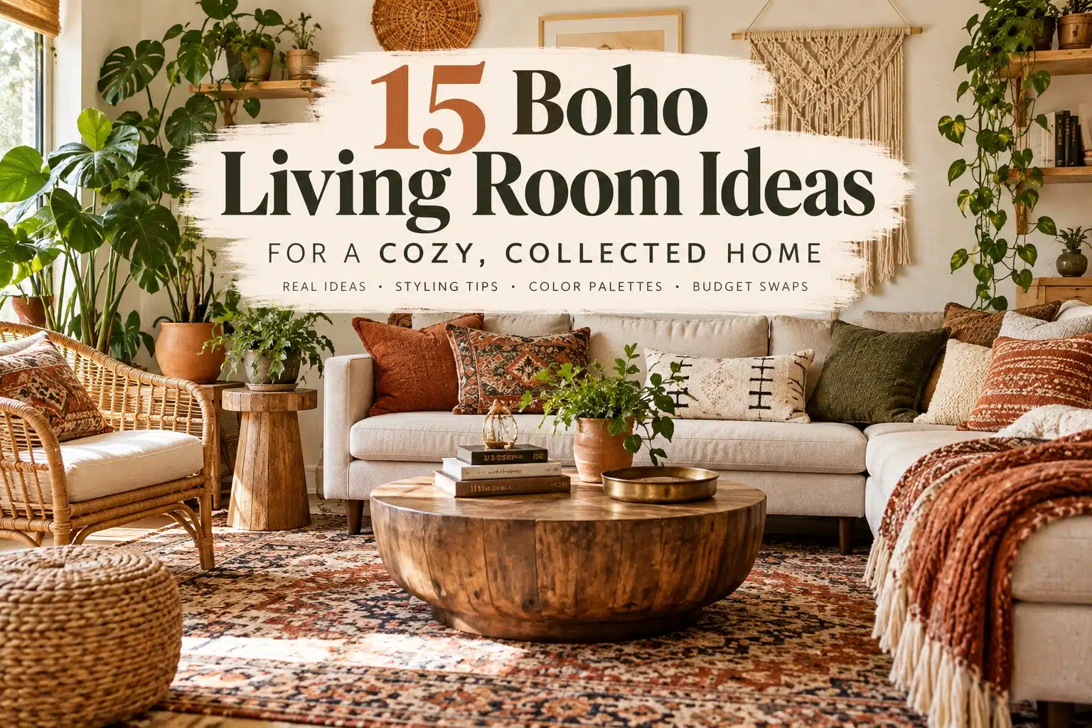
15 Boho Living Room Ideas for a Cozy, Collected Home
A boho living room usually fails in one of two directions. Either it’s so neutral and pared-back that it stops feeling boho at all, or it’s so full of plants, baskets, and patterned pillows that it starts to look like a stockroom. The rooms that actually work sit in between: natural materials, layered texture, a bit of pattern, comfortable seating, a few personal or vintage pieces, and enough open space that all of it can breathe.
This guide walks through 15 ways to get there, plus color palettes, small-space fixes, a modern-vs-vintage breakdown, and budget-friendly swaps — whether you’re starting from a bare rental living room or reworking one that already feels close but slightly off.
A boho living room usually feels most cohesive when you start with a clear base palette, layer natural materials such as wood, rattan or cane, add texture through rugs and textiles, and mix in a few personal, vintage or handmade pieces. Warm neutrals are an easy starting point, but earthy, colorful and darker palettes can work too. The key is to repeat enough colors and materials to connect the room, then leave some wall, floor and surface space open so the layers do not turn into clutter.
What Makes a Living Room Look Boho?
Boho rooms read as relaxed, layered, collected, and personal rather than matched or themed. The common ingredients are natural wood, rattan and cane, layered textiles, patterned rugs, vintage pieces, plants, handmade decor, personal artwork, and a mix of furniture styles instead of a matching set.
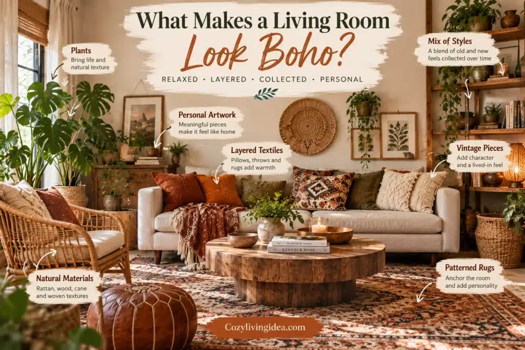
When you’re considering a new piece, ask whether it adds a different material, shape, texture, color or personal story to the room rather than simply repeating everything already there. Boho rooms often feel collected rather than matched, but the goal is cohesion—not randomness.
The mistake most people make isn’t picking the wrong materials — it’s stopping at addition. Every idea below either adds something specific or tells you when to stop.
The style is intentionally flexible rather than defined by one fixed palette or furniture set; Architectural Digest likewise describes bohemian interiors through eclectic combinations of natural materials, vintage and new furniture, handmade pieces, color and pattern.
15 Best Boho Living Room Ideas
1. Use a Warm Neutral Base When You Want an Easy Starting Point
Best for: any boho style, especially as a starting point Key materials/colors: warm white, cream, beige, sand, light taupe Why it works: Warm white, cream, beige, sand and light taupe create a quiet backdrop that allows wood, textiles, plants and stronger accent colors to stand out. This is one of the easiest ways to build a boho palette, but it is not the only option—colorful and darker bases can work when the rest of the room is coordinated around them.
Try this: Pair a warm white or sand wall with darker wood furniture, one or two plants, a patterned textile, and a hit of terracotta or black. A useful starting palette is warm white + tan + walnut + olive + rust.
Avoid: Making every surface the same beige tone. If the room starts feeling flat, introduce contrast through darker wood, greenery, pattern, metal or a richer accent color.
2. Anchor the Room With a Large Patterned Rug
Best for: defining the seating area Key materials/colors: Persian-inspired, Moroccan-style, kilim patterns, muted geometrics, or a jute base layered under a patterned rug Why it works: A rug is the single biggest visual anchor in a boho living room, and pattern here does more work than pattern anywhere else in the space.
Try this: Choose a rug large enough to visually connect the main seating group. In many living rooms, having at least the front legs of the sofa and primary chairs on the rug creates a cohesive arrangement, but the exact placement should fit your furniture layout and room dimensions.
Avoid: A rug that only fits under the coffee table. When the sofa and chairs float off the edge of the rug, the whole seating area looks unanchored, no matter how good the pattern is.
3. Mix Natural Wood, Rattan, and Cane
Best for: building texture without adding more objects Key materials/colors: a wood coffee table, cane-front cabinet, rattan armchair, woven side table, basket storage Why it works: These materials create visual depth through their surface texture alone, so you get richness in the room without needing to fill it with more decor.
Try this: Mix woven materials with smoother surfaces so the room does not become texturally repetitive. For example, pair a cane-front cabinet or rattan chair with a solid wood table, ceramic lamp and upholstered sofa rather than making every major piece woven.
Avoid: Treating rattan and cane as decoration you add on top — they work best as actual furniture, not accessories.
4. Layer Texture Instead of Adding More Stuff
Best for: the sofa and seating area specifically Key materials/colors: linen, cotton, wool, jute, bouclé, fringe, woven fibers, handmade ceramics Why it works: This is the difference between a boho room and a cluttered one. Texture reads as richness even when the color palette stays simple, which means you can add visual interest without adding more objects to dust.
Try this: A workable formula is a linen sofa + wool rug + one woven throw + a walnut coffee table + a ceramic lamp base. Notice that’s five pieces, not fifteen.
Avoid: Adding several pillows or throws that contribute the same color, texture and visual weight. Layering works better when each textile adds something distinct and the sofa still has enough usable seating space.
5. Mix Patterns Around One Color Story
Best for: cushions, throws, and smaller textiles Key materials/colors: any combination, as long as color repeats Why it works: Patterns clash when they don’t share a color anchor, not because you used “too many patterns.” A shared color story is what lets three or four different prints sit together comfortably.
Try this: One possible mix is a solid textile, a geometric print, an organic or botanical pattern, and a heavily textured piece such as bouclé or fringe. Whatever combination you choose, repeat one or two colors across the textiles and vary the pattern scale so they relate without looking identical.
Avoid: Choosing each pattern in isolation. Put the fabrics or samples beside one another first and look for a repeated color, similar undertone or intentional contrast that connects them.
6. Add Greenery or Another Organic Element
Best for: adding life and softening hard lines Key materials/colors: floor plants, trailing plants, branches, dried stems or convincing faux greenery where appropriate Why it works: Greenery is one way to soften furniture lines and reinforce the natural-material side of boho interiors. You do not need a room full of houseplants—the same organic effect can come from a carefully chosen plant, seasonal branch arrangement or other natural element.
Try this: If plants suit the room, use one larger plant or a small number of plants at different heights rather than filling every surface. Choose species that suit the available light and your household.
Avoid: Matching pots on every plant. A little variation in pot material — one woven basket planter, one ceramic — supports the collected look better than a uniform set.
7. Create a Collected Gallery Wall
Best for: an empty wall behind the sofa or in a reading corner Key materials/colors: vintage artwork, botanical prints, travel photography, small paintings, personal photos, mirrors, textile pieces Why it works: A gallery wall is one of the most efficient ways to add personality and pattern to a boho room without adding floor clutter.
Try this: Give the gallery at least one repeated element. That could be similar frame tones, recurring colors in the artwork, consistent spacing, or a shared subject matter. You do not need every frame to match.
Avoid: Hanging pieces without first checking the overall composition. Lay the arrangement out on the floor or mock it up before putting holes in the wall, especially when frame sizes vary considerably.
8. Add One Statement Vintage Piece
Best for: giving the room a focal point with real character Key materials/colors: a vintage armchair, antique chest, carved cabinet, old wood coffee table, or a sculptural vintage lamp Why it works: One strong vintage piece usually adds more genuine personality to a room than five smaller mass-produced “boho” accessories combined, because it has an actual history and a shape nothing else in the room has.
Try this: Pick the piece that gets the most daily use or visual attention — a coffee table or an accent chair — rather than a decorative object that just sits on a shelf.
Avoid: Buying several new pieces from the same coordinated “vintage boho” collection if your goal is a collected look. Reproduction pieces can work perfectly well; the problem is repetition, not whether an object is genuinely old.
9. Mix Old and New Furniture
Best for: avoiding the matching-showroom look Key materials/colors: a clean-lined sofa, a vintage chair, a rustic coffee table, a modern floor lamp Why it works: Matching furniture sets tend to work against a boho room, because “collected over time” is the whole point of the style — a full matching set signals the opposite.
Try this: Keep one large piece (usually the sofa) clean and contemporary, then let the smaller pieces around it — chair, side table, lighting — carry the vintage or eclectic character.
Avoid: Letting every furniture piece share the same finish, silhouette and upholstery. If you already own a matching set, you do not need to replace it—introduce variation through a different coffee table, side chair, lighting, rug or textiles.
10. Use an Earthy Boho Color Palette
Best for: a warm, grounded look Key materials/colors: terracotta, rust, olive, ochre, camel, chocolate brown, muted red Why it works: Terracotta, rust, olive, ochre and brown naturally connect with materials commonly used in boho interiors, such as wood, clay, leather, jute and rattan. That makes them an easy palette to combine with layered natural textures.
Try this: Cream + terracotta + olive + walnut is one useful earthy combination. Let one light tone carry most of the visual area, then use the richer colors in smaller or more concentrated areas rather than distributing every color equally.
Avoid: Spreading every color evenly across the whole room. Distribute unevenly — more of the light neutral, less of the deepest accent — so the palette doesn’t look like a swatch card.
11. Add Color Without Losing the Boho Feel
Best for: anyone who wants boho without going all-beige Key materials/colors: teal, mustard, burgundy, deep blue, coral, emerald, plum Why it works: Boho doesn’t require a neutral palette — it just requires that the colors feel collected rather than matched to a single accent wall.
Try this: A palette such as teal + rust + mustard + warm cream works best when the colors appear in more than one part of the room—for example, linking a cushion to artwork or a rug rather than isolating every color in a single object.
Avoid: Adding one unrelated bright object to an otherwise disconnected palette and expecting it to establish the whole color scheme. Repeat or echo the color elsewhere if the room needs more visual connection.
12. Use Relaxed, Flexible Seating
Best for: a lived-in, comfortable feel Key materials/colors: poufs, ottomans, lounge chairs, deep sofas, occasional floor cushions Why it works: Flexible seating supports the relaxed feel boho is known for, and it gives you extra seating for guests without committing to a second full chair.
Try this: Keep flexible pieces like poufs and floor cushions along the edges of the room or tucked under a console when not in use, rather than parked permanently in the walking path.
Avoid: Adding more loose seating than the room can comfortably accommodate. Poufs and floor cushions are useful only when they do not narrow walkways or interfere with everyday movement.
13. Layer the Lighting
Best for: making all the texture in the room actually visible Key materials/colors: rattan, linen, ceramic, brass, and woven-fiber fixtures Why it works: Using light from more than one height can reveal texture and create a softer evening atmosphere than relying only on a bright central fixture. It also lets you use different lights for general illumination, reading and accenting artwork or architectural features.
Try this: Cover the roles your room actually needs: ambient light for the overall room, task lighting near reading or seating areas, and optional accent lighting for artwork, shelving or decorative features. Materials such as woven fiber, linen, ceramic, wood or brass can reinforce the boho look, but choose fixtures primarily for function, scale and the effect you want.
Avoid: Depending on a single fixture when it leaves seating areas dim or produces harsh contrast. Add lighting where the room actually needs it rather than simply increasing the fixture count.
14. Decorate With Personal and Collected Objects
Best for: the final layer of personality Key materials/colors: books, travel finds, handmade pottery, family pieces, vintage objects, photography, artwork Why it works: Personal objects are what separate an actual boho living room from a showroom styled to look like one — they can’t be bought as a matching set, so they automatically read as collected.
Try this: Group objects you already own — books, pottery, travel souvenirs — into small clusters of two or three on a shelf or console rather than spreading them thin across the whole room.
Avoid: Buying decorative filler purely to occupy an empty surface. An empty shelf is a better outcome than a shelf filled with objects that have no story.
15. Edit the Room Instead of Filling Every Empty Space
Best for: the final pass on any boho room Key materials/colors: applies to layout, not materials Why it works: Boho does not mean clutter, even though the two get confused constantly. Empty space is what lets the best textures, colors, and objects in the room stand out instead of competing with everything else.
Try this: Leave clear pathways, some blank wall space, breathing room around furniture, a partially empty shelf, and a section of the coffee table with nothing on it.
Avoid: Treating every flat surface as a display opportunity. Once the room has its rug, its texture layer, its gallery wall, and a couple of personal objects, the strongest move left is usually to stop adding and start removing.
4 Boho Living Room Color Palettes to Copy
These are starting combinations rather than fixed formulas. Adjust the proportions and exact shades around the flooring, upholstery, wood tones and other finishes already in your room.
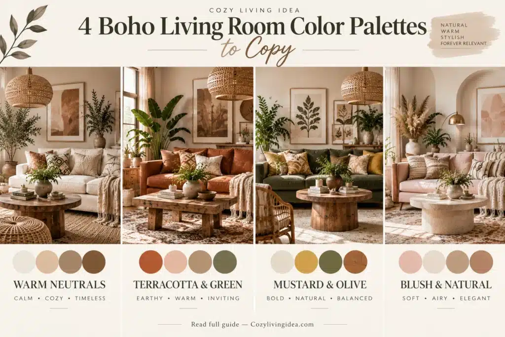
Cream + Terracotta + Warm Wood
Mood: Warm • Earthy • Relaxed Cream on the walls and sofa, terracotta in cushions and one accent piece, warm wood across the coffee table and shelving.
Beige + Olive + Rust
Mood: Organic • Cozy • Collected Beige as the base across walls and rug, olive in upholstery or a throw, rust in artwork or a single accent chair.
White + Tan + Black
Mood: Modern • Clean • High Contrast White walls, tan leather or linen seating, black in lighting fixtures, frames, or hardware for contrast against all the natural texture.
Teal + Mustard + Rust + Cream
Mood: Colorful • Eclectic • Expressive Cream as the neutral base, teal and mustard repeated across cushions and art, rust in a rug or a vintage accent piece.
Small Boho Living Room Ideas
Small boho living rooms benefit from the same layered materials as larger rooms, but each piece needs to justify the floor or surface space it uses. Start with the seating layout and circulation before adding decorative layers. A rug large enough to connect the main seating group can make the arrangement feel more cohesive, while multifunctional furniture—such as a storage ottoman or nesting tables—can reduce the need for extra pieces.
Use the walls when floor space is limited: artwork, shelving or a textile can add character without taking up a walking path. Furniture with visible space beneath it can also create a lighter visual effect, although comfort and storage matter more than exposed legs alone. Keep small accessories edited and group them intentionally rather than scattering objects across every available surface.
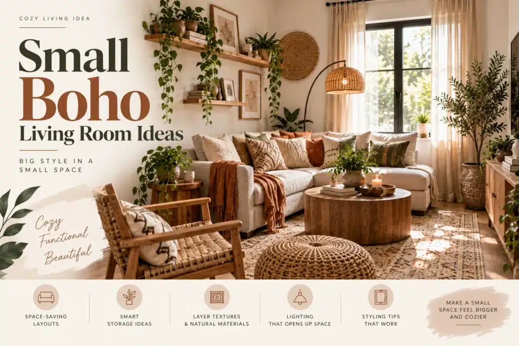
Decorating vertically, with a tall bookshelf or a gallery wall that draws the eye up, uses wall space you’re not competing for with furniture. Hanging plants instead of lining up floor pots frees up actual floor space for walking. Multifunctional pieces like ottomans with storage do double duty.
Keep to one hero pattern rather than several competing ones, and reduce small accessories — in a small room, five little objects read as clutter faster than they would in a larger one. Use baskets to hide overflow storage, keep pathways genuinely open, and resist the urge to fill every wall.
In a compact room, establish one clear visual focal point—a rug, artwork, statement chair or textile—then let the supporting elements remain quieter. The goal is hierarchy, not a fixed limit on how many patterns the room can contain.
Compact-room formula: a correctly scaled sofa + a rug that connects the seating area + one additional flexible seat if needed + vertical art or storage + intentional lighting + only the accessories that still leave comfortable circulation.
If furniture placement and circulation are the bigger challenge, our Small Space Living Ideas guide goes deeper into choosing furniture scale, arranging compact layouts and making limited floor space work harder.
Modern vs. Neutral vs. Vintage Boho Living Room
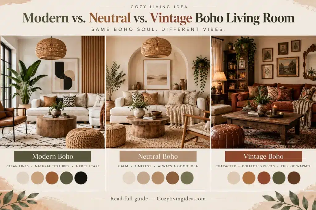
Modern boho leans on cleaner lines, fewer accessories, natural materials, larger-scale artwork, controlled pattern, oversized plants, and a simpler color palette overall. It’s the version to choose if you want the boho feel without the visual density.
Neutral boho stays largely within cream, beige, tan, brown and warm white, allowing texture rather than strong color contrast to carry much of the interest. It can be convenient in rentals where major surfaces cannot be changed, but always build the palette around the actual wall, flooring and cabinetry colors already present.
Vintage boho brings in a Persian-inspired rug, antique furniture, dark wood, brass fixtures, vintage art, and genuinely collected objects. It’s the most layered and the most personal, but also the version that takes the longest to build, since it depends on pieces you find over time rather than buy in one trip.
The difference between them isn’t the presence or absence of boho elements — it’s how much restraint and how much history each one asks for.
Boho Living Room Ideas on a Budget
Not every boho update requires new furniture. In rough order of visual impact for the money:
- ✓
Rearrange the furniture you already have — pulling seating together and off the walls often does more than any single purchase.
- ✓
Replace pillow covers instead of whole pillows — this is one of the cheapest ways to shift a color palette.
- ✓
Add or upgrade the rug, since it anchors the whole room and is usually the highest-impact single item.
- ✓
Thrift artwork for a gallery wall instead of buying new prints.
- ✓
Buy one secondhand statement piece — a chair or coffee table — instead of several small new accessories.
- ✓
Add warmer lighting, such as a floor lamp with a fabric or rattan shade, to soften an overhead fixture.
- ✓
Display books you already own, stacked or shelved, instead of buying new decorative objects.
- ✓
Frame inexpensive fabric or prints rather than buying framed art outright.
- ✓
Use baskets for storage instead of closed cabinets, which tend to cost more.
- ✓
Repurpose a stool as a side table rather than buying a matching one.
The rug, the rearrangement, and the lighting tend to create the biggest visible difference first — small accessory swaps matter, but they’re the last layer, not the first.
If you’re deciding which pieces are worth spending more on and where you can save, our Budget Home Decor Ideas guide offers a broader framework for prioritizing decorating purchases.
5 Boho Living Room Mistakes to Avoid
1. Adding too many small accessories. Layered means different textures and materials doing distinct jobs. Cluttered means volume for its own sake. If you can’t explain why a piece is there, it’s probably clutter.
2. Mixing patterns without any visual relationship. Patterns are easier to combine when something connects them—a repeated color, similar undertone, complementary scale or intentional contrast. Before buying, put the textiles beside one another rather than evaluating each separately.
3. Buying everything from one matching “boho” collection. This produces a themed room, not a collected one — the opposite of what boho is going for. Mix sources and eras instead.
4. Using a rug that is noticeably undersized for the seating area. The exact layout varies, but the rug should visually connect the main furniture rather than floating independently beneath the coffee table.
5. Using too many similar materials without contrast. A rattan chair, rattan table, wicker baskets, a woven light fixture, and beige walls together can go visually flat despite being “correct” individually. Balance woven materials with smooth wood, ceramic, metal, or a darker accent to keep the room from reading as one texture repeated five times.
Final Thoughts
A boho living room isn’t built by buying more products labeled “boho” — it comes together through natural materials, layered texture, pattern that shares a color story, comfortable and slightly mismatched furniture, a few personal or vintage objects, and enough open space for all of it to actually be seen.
The rooms that feel overdone usually have all the right ingredients but no editing; the ones that feel flat usually stopped at neutral and never added the layer of texture or personality that makes boho recognizable in the first place.
If your main goal is creating a warmer, more comfortable living room rather than committing fully to boho style, our Cozy Living Room Ideas guide covers lighting, furniture arrangement, texture and focal points in more detail.
If the whole list feels like a lot to take on at once, start with one change instead of a full redesign: rug → palette → lighting → one vintage piece → textiles. Each step makes the next one easier to see.
FAQ Frequently Asked Questions
A mix of natural materials (wood, rattan, cane), layered textiles, a patterned rug, some vintage or personal pieces, plants, and furniture that doesn’t all match. The overall feel should be relaxed and collected rather than themed.
Warm neutrals such as cream, beige and tan are common starting points, but earthy tones like terracotta, olive and rust—as well as stronger colors such as teal, mustard, blue or plum—can all work. Look for a palette that relates to the room’s existing materials and repeat or echo enough colors to make the overall scheme feel connected.
Yes. Modern boho uses the same natural materials and textures as traditional boho, but with cleaner furniture lines, fewer accessories, and a simpler, more controlled color palette.
Use one properly sized rug, furniture with exposed legs, vertical decorating, hanging plants instead of floor pots, and one hero pattern instead of several. Reduce small accessories more aggressively than you would in a larger room.
Layer texture instead of adding more objects, anchor patterns to a shared color story, and deliberately leave some wall space, shelf space, and surface space empty once the main pieces are in.