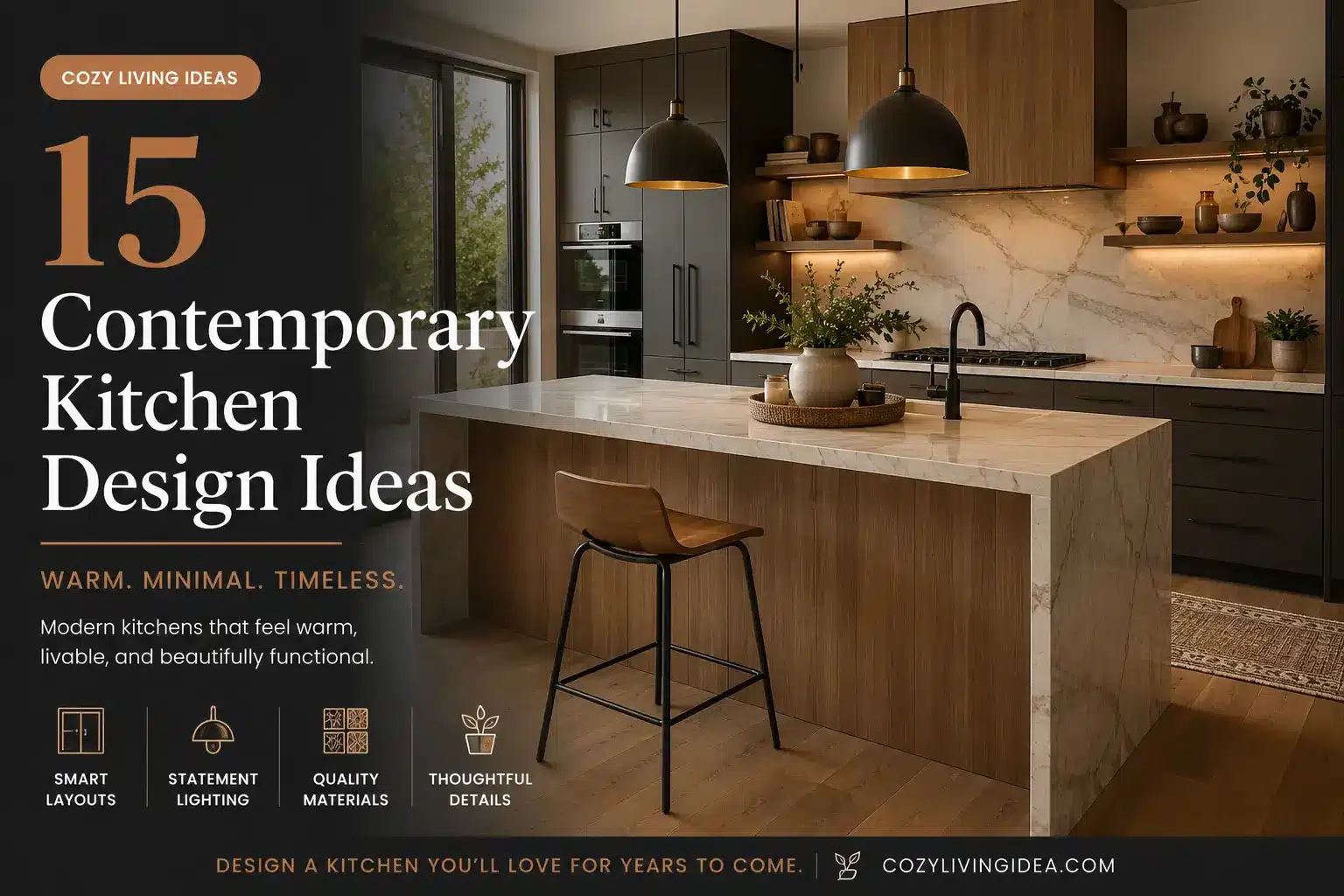
Contemporary Kitchen Design Ideas : 15 Principles for a Sleek, Functional Space
A client texted me a photo last spring of three paint swatches taped to her cabinets, with the message: “I don’t want it to look like everyone else’s kitchen. But I also don’t want it to feel cold.” That’s basically every contemporary kitchen brief I get now, boiled down to one text message.
For years, “modern kitchen” was shorthand for all-white cabinets, chrome pulls, and a subway tile backsplash. It photographed beautifully. It also started to feel a little like a dentist’s office by year three. What’s replaced it is warmer, more textured, and honestly a lot more forgiving to live in — the clean lines stayed, but the sterility didn’t have to.
This isn’t a trend roundup. It’s the stuff I actually specify when someone wants their kitchen to look current in ten years, not just this spring. Some of it costs a weekend and a hardware order. Some of it is a full renovation. Either way, you’ll know which ideas are yours by the third one on this list.
Why Contemporary Kitchen Design Looks Different Now
Three shifts changed what “contemporary” even means in a kitchen.
Open floor plans put the kitchen permanently on display. It’s not a room you shut a door on anymore — it has to hold its own next to your sofa and your rug, which means it needs personality, not just cleanliness.
People are also renovating less often and living with their choices longer, so the smart money moved away from finishes that peak fast — glossy white lacquer, chrome everything — toward ones that age slowly. Wood darkens and gets better. Honed stone doesn’t show wear the way polished stone does. Matte finishes hide fingerprints instead of announcing them.
And texture quietly took over the job color used to do. Instead of an accent wall, a contemporary kitchen now gets its personality from the contrast between warm oak, matte black, brushed brass, and honed stone sitting next to each other. The interest comes from touch, not from a paint chip.
Benefits of a Contemporary Kitchen Refresh
A kitchen update is one of the few home projects that pays you back in more than one currency.
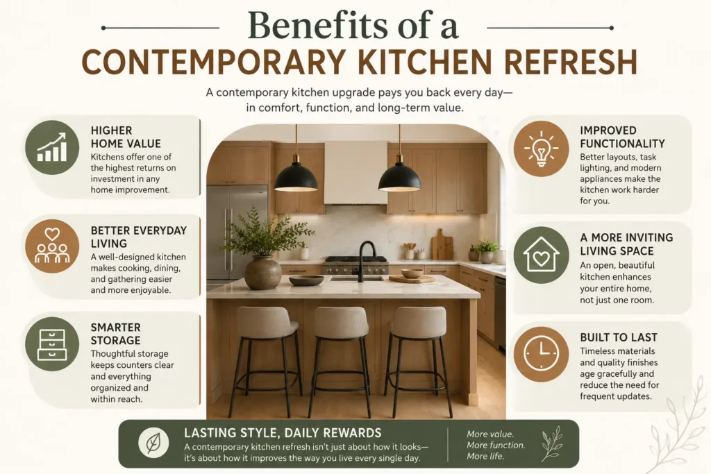
It’s still the highest-ROI room in most resale conversations, but that’s almost the boring reason to do it. The better reason is that a well-laid-out contemporary kitchen just works harder — island seating that actually gets used, storage that keeps counters clear, appliances that don’t fight the room for attention. And because an open kitchen is now part of your living space rather than separate from it, getting the design right does double duty: it makes the whole downstairs feel more finished, not just the kitchen.
How to Design a Contemporary Kitchen: Key Considerations
Before getting into individual elements, it helps to hold the whole picture in your head at once. Every principle in this guide falls under one of five considerations — think of them as the checklist a designer runs through before specifying a single cabinet door.
- ✓
Line simplicity over ornamentation Contemporary spaces read clean because there’s less visual noise to process — flat panels instead of raised ones, minimal trim, hardware that doesn’t compete with the cabinetry.
- ✓
Material contrast, used sparingly One warm material against one cool one (wood against stone, matte against gloss) does more work than five different finishes competing for attention.
- ✓
Light as a functional layer, not just an aesthetic one A contemporary kitchen needs task lighting where you actually work, not just ambient light for the room as a whole.
- ✓
Clearance and flow before size How much space exists between an island and the counter matters more than how large the island is.
- ✓
Storage that’s planned, not squeezed in Contemporary kitchens tend to look uncluttered because storage was designed around specific items — not because the homeowner owns less.
A kitchen designer once described her first walk through of a client’s existing kitchen as an audit, not a wish list: she’d ask what’s actually stored where, what gets used daily versus once a year, and where people naturally stand while cooking, before ever discussing cabinet finishes. That’s a useful habit to borrow. Most kitchens don’t need a full gut renovation to feel contemporary — they need the existing footprint used more deliberately.
15 Contemporary Kitchen Design Ideas That Don’t Feel Cold or Sterile
1. Get the Kitchen Island Right (Clearance Over Size)
Islands are the piece homeowners most often size incorrectly, usually by going too big. Among kitchen island ideas, the ones that actually hold up have less to do with size or finish and more to do with movement — the island needs to solve for how people walk and work before it solves for storage or seating. The number that matters most isn’t the island’s dimensions — it’s the clearance around it.
- ✓
42 inches minimum between the island and surrounding counters or cabinetry, for a single cook working the space comfortably.
- ✓
48 inches if the kitchen sees two people cooking at once, or if the island includes seating on one side where chairs will be pulled out.
- ✓
36 inches is workable only in a genuinely tight footprint, and even then it should be reserved for a walkway edge rather than the primary work aisle.
These figures line up with the working-aisle clearances the National Kitchen & Bath Association recommends in its kitchen planning guidelines, which is a useful reference if you’re working with a contractor and want a shared standard to design against rather than a rule of thumb.
An island that leaves less than 36 inches of clearance on any side isn’t a contemporary design choice — it’s a layout that will feel cramped daily regardless of how the cabinetry looks. If your existing kitchen can’t accommodate a full island with proper clearance, a narrower rolling cart or a peninsula (an island connected to the perimeter on one end) often solves the same problems without forcing the clearance issue.
2. Choose Cabinetry That Defines the Whole Room
Cabinetry is the single largest visual surface in most kitchens, which makes it the fastest lever toward — or away from — a contemporary look, and it’s where most current kitchen cabinet trends actually live.
Flat-panel (also called slab) doors are the clearest signal of contemporary style; they skip the raised centers, routed edges, and applied moldings that read as traditional or transitional. Shaker doors can still work in a contemporary kitchen, but only in a thin-rail, minimal-detail version — a heavy, deeply beveled shaker door pulls the whole room toward farmhouse instead.
Two cabinet decisions matter more than most homeowners expect:
- ✓
Handleless or integrated-pull cabinetry creates an especially clean, contemporary line, using either a routed finger-pull channel or a push-to-open mechanism. It’s a bigger investment than standard hardware but changes the whole read of a kitchen.
- ✓
Two-tone cabinetry — a different finish on the island than on the perimeter, or upper cabinets in a lighter tone than lower ones — adds depth without adding ornamentation. It’s one of the more reliable ways to make a kitchen feel designed rather than default.
Paint your swatch onto a large sheet of poster board rather than directly on the wall, and move it around the room at different times of day. A color that looks perfect at noon by the window can look entirely different in lamp light by the sofa at 8 p.m. — and lamp light is when you’ll actually be using the room most.
3. Open Shelving, Done Sparingly
Floating wood shelves in place of upper cabinets on one wall — thick, substantial ones, not the thin trim-style shelves that look like an afterthought. Solid oak or walnut, an inch and a half to two inches deep, is what keeps this from looking flimsy.
I’ll be honest about the tradeoff: open shelving only works if you’re the kind of person who keeps your dishes tidy, because everything’s on display all the time. If that’s not you, don’t fight it — a single shelf for cookbooks and one nice bowl is plenty, and it still gets you the texture without the daily maintenance. The mistake I see most is overfilling it. The gaps between grouped items are doing as much visual work as the objects themselves.
4. Contemporary Kitchen Colors That Won’t Feel Outdated in 5 Years
Contemporary kitchen colors lean toward warm neutrals as a base — the all-white kitchen of the last decade is giving way to warmer whites, greiges, and even full-cabinetry color in muted, earthy tones like sage, olive, and warm terracotta. The through-line across current contemporary kitchens isn’t a specific color so much as confidence in a single tone, used across the full run of cabinetry rather than broken up with multiple competing accents.
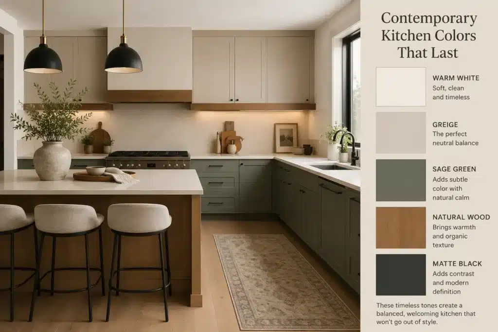
A dependable approach: choose one dominant cabinet color, keep walls a quiet neutral that doesn’t compete with it, and reserve any bolder color for a single element — an island, a range hood, or open shelving — rather than spreading it across the whole room. This mirrors the 60-30-10 principle used in other rooms: the cabinetry carries the dominant tone, countertops and backsplash carry a secondary tone, and any accent color shows up in just one or two deliberate places.
Black or near-black cabinetry, once considered a bold outlier, has become a fairly standard contemporary choice, but it reads best in kitchens with strong natural light or a lighter countertop and backsplash to offset the weight. In a kitchen with limited natural light, a warm mid-tone (walnut, olive, warm gray) tends to hold up better over time than either stark white or true black.
5. Small Contemporary Kitchen Ideas That Actually Work
A small kitchen can absolutely read as contemporary — the principles above scale down rather than disappear. A few adjustments matter more in a tight footprint:
- ✓
Handleless or integrated-pull cabinetry matters even more in a small kitchen, since protruding hardware in a tight walkway is both a visual and physical obstacle.
- ✓
A single continuous countertop and backsplash material , rather than a break between the two, makes a small kitchen feel larger by removing a visual seam.
- ✓
Under-cabinet lighting does more relative work in a small kitchen, since there’s less room for a separate ambient fixture to compensate for shadowed counters.
- ✓
A narrow rolling island or cart in place of a fixed island preserves the clearance a small kitchen can’t spare, while still adding prep space and storage.
- ✓
Light, warm cabinetry on at least the lower run keeps a small kitchen from feeling closed in — reserve darker tones for upper cabinets or a single accent wall if you want contrast.
Small kitchens also benefit disproportionately from the storage principles in Section 8 — deep drawers and vertical dividers matter more when there’s simply less total cabinet volume to work with. It’s the same logic behind good small-space design anywhere in a home: our guide Apartment Bedroom Decor Ideas: 15 Fresh Ways to Style It covers the same space-maximizing thinking for a small bedroom footprint.
6. Panel-Ready Appliances
Fridge, dishwasher, sometimes the hood, faced with cabinet panels that match the rest of the room instead of exposed stainless steel. The cabinetry reads as one continuous run, which is basically the whole game in contemporary design — fewer visual breaks, calmer room.
This one’s genuinely expensive and usually only makes sense if you’re already gutting the kitchen — it’s not really a standalone weekend upgrade. And a small note from experience: panel-front everything and you can lose track of where the fridge actually is. Leave the range and hood exposed as a visual anchor; panel the rest.
7. Large-Format Slab Backsplashes
One continuous slab of stone or porcelain from counter to cabinets, instead of individual tiles with a grid of grout lines. Fewer seams reads as calmer and, oddly, more expensive-looking even when the material cost is comparable to tile.
Porcelain slab has closed a lot of the price gap with natural stone in the last few years and it’s easier to keep clean, so it’s worth asking your fabricator about it even if you assumed stone was out of budget. The one thing to watch: don’t match the backsplash too exactly to the countertop. A subtle shift — same stone family, different cut — keeps your eye moving across the wall instead of flattening it into one giant slab of sameness.
8. A Curved Island Corner
One rounded corner, or a fully curved island profile, instead of hard right angles everywhere. It’s a small detail with an outsized effect — a single soft edge in an otherwise linear room reads as intentional, and if you’ve got kids running through the kitchen, it’s the corner nobody bruises a hip on.
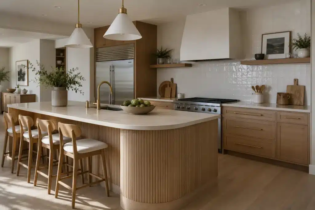
This is custom millwork territory, so it’s not a budget move. And restraint matters here more than almost anywhere else on this list: curve one thing. Curve the island, the peninsula, and the pendant shapes all at once and it starts to look like you couldn’t commit to a direction, rather than like a deliberate softening move.
9. Layer Lighting the Way You Would in a Living Room
Kitchens get treated as purely functional spaces, which is exactly why so many rely on a single flush-mount or recessed-light grid and call it done. A contemporary kitchen needs the same layered approach as any other room: ambient, task, and accent light, each doing a different job.
- ✓
Ambient light — recessed cans or a central fixture — sets the base level so the room isn’t dark.
- ✓
Task light — under-cabinet LED strips are the highest-impact addition most kitchens are missing — illuminates the counter itself, where shadows from overhead light otherwise fall directly on your hands while you work.
- ✓
Accent light — pendants over an island, or a lit open shelf — adds visual layering and warmth once the sun goes down, the same way a table lamp does in a living room.
Pendant lighting over an island is one of the fastest ways to signal a contemporary kitchen, but sizing matters: a cluster of two or three smaller pendants generally reads more current than a single oversized fixture, and pendants should hang with roughly 30 to 36 inches between the bottom of the fixture and the counter surface, adjusted for ceiling height.
Warm-temperature bulbs (2700K–3000K) keep a contemporary kitchen from feeling clinical, even with cooler-toned materials elsewhere in the room. Reserve daylight-temperature bulbs (4000K+) for task lighting only, where color accuracy while cooking matters more than ambiance. ENERGY STAR’s lighting guidance is a good reference if you’re unsure which Kelvin rating to buy for which fixture.
10. Rethink Storage Before You Rethink the Layout
A cluttered contemporary kitchen isn’t really contemporary — visual restraint depends on having somewhere for everything to go. Before assuming a kitchen needs more cabinets or a bigger footprint, it’s worth auditing what’s actually stored where, since most storage problems are about organization within the existing space rather than a genuine shortage of it.
A few upgrades that consistently free up counter and cabinet space without adding square footage:
- ✓
Deep drawers instead of lower cabinets with shelves, since drawers make everything visible and reachable without kneeling
- ✓
A dedicated appliance garage or pull-out shelf for the items that otherwise live permanently on the counter
- ✓
Vertical dividers for sheet pans and cutting boards, which are notoriously hard to store flat
- ✓
Toe-kick drawers, which use otherwise-wasted space at the base of lower cabinets for flat items like trays or platters
- ✓
Open shelving used sparingly — for the handful of items worth displaying, not as a catch-all
Open shelving is one of the more polarizing contemporary choices, and for good reason: it only looks intentional when what’s on it is curated and used regularly. A shelf that becomes a landing pad for mail and mismatched mugs works against the restraint that makes a kitchen feel contemporary in the first place.
11. A Window Ledge for Herbs
A small shelf or recessed ledge near a sunny window, stocked with potted basil, thyme, whatever you actually cook with. It’s the cheapest idea on this list and it does more to make a kitchen feel alive than almost anything with a bigger price tag.
Keep it away from direct heat — herbs sitting right over the stove will cook slowly from the bottom up, no matter how good the light is. A nearby window beats a spot over the burners every time.
12. Built-In Banquette
Upholstered bench seating built into a corner, replacing a standalone table-and-chairs setup. It uses corner space more efficiently than furniture ever will, and the upholstery adds a soft texture that balances out all the hard surfaces a kitchen tends to accumulate.
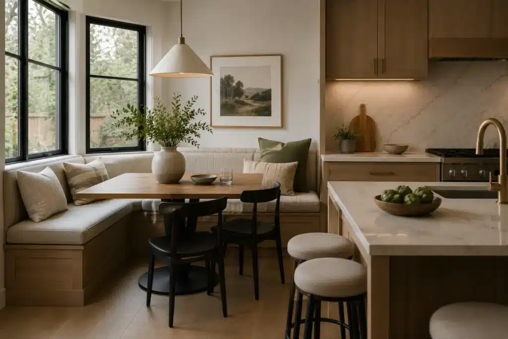
Spend the extra money on performance fabric. A banquette in an actual working kitchen needs to survive spilled juice and dropped forks, not just look good in the listing photos — a bouclé or linen-look polyester blend rated for performance use will save you from re-upholstering in two years.
13. Two Metals, Not One
Brushed brass on the lighting and hardware, matte black on the faucet — one dominant metal tone plus a second in a defined role, instead of matching every single finish in the room. A kitchen where everything’s the same metal can start to feel like a showroom display rather than a room someone actually lives in.
This might be the best value on the entire list. Updating hardware and a faucet is a weekend project and a few hundred dollars, and it changes the whole feel of a kitchen more than almost any other single move. Just stop at two metals — three starts to look unplanned rather than intentional.
14. One Bold Island, Neutral Everything Else
Keep the perimeter cabinets neutral and paint just the island — hunter green, ink blue, deep burgundy. You get a real color statement without repainting the whole room, and it reinforces the island as the thing your eye lands on first.
Go matte or satin, not high gloss — gloss reads dated faster than the color itself does. And pull back slightly on saturation, especially on the high-traffic sides of the island. The most intensely saturated version of a color you love will show wear and start to feel a little much faster than a slightly muted version of that same color — which, counterintuitively, tends to look more expensive anyway.
15. Handmade-Look Tile in One Spot
Zellige, fluted, or scalloped tile with the slight irregularity of handmade pieces — used behind the range or on a small accent wall, not across the whole kitchen. The imperfection is the appeal. It catches light differently piece to piece in a way that flat, uniform tile just can’t fake.
Keep the grout close in color to the tile. A high-contrast grout line turns a beautiful, organic texture into a rigid grid, which defeats the entire point of choosing handmade-look tile in the first place.
Designer Tips for a Kitchen That Feels Expensive
- ✓
Vary your sheen Matte cabinets, a honed countertop, and a slightly glossy backsplash sitting next to each other create more depth than a kitchen where every surface has the same finish.
- ✓
Anchor with one substantial materialA heavy stone edge, a thick wood shelf, a hardware pull with real weight to it — one well-made, substantial detail reads as quality faster than five delicate ones combined.
- ✓
Let counter space stay emptyGenuinely empty, not “empty except for the coffee maker and the fruit bowl and the mail.” Negative space is doing real design work — it’s the difference between designed and decorated.
- ✓
Repeat your metal and wood tones, don’t match them exactlyIf your hardware is brass, echo it in a light fixture or faucet. Repetition creates cohesion; matching everything exactly flattens the room.
Color and Texture Principles for Contemporary Kitchens
Most contemporary kitchens that age well use a light, a mid, and a dark tone within the same warm or cool family, rather than two competing hues fighting for attention.
Something hard and reflective (stone, glass, glazed tile), something matte (painted cabinetry, honed stone), and something soft or organic (wood, a woven stool, a plant). Hit all three and a kitchen feels complete.
A waterfall island only looks sculptural if the slab is thick enough to hold visual weight — under about an inch and a quarter, it starts to look thin instead of substantial.
Budget-Friendly Ways to Get the Look
Start with hardware and lighting. Genuinely, these two changes move the needle more per dollar than anything else on this list.
Paint the island instead of the whole kitchen if you want a bold color moment without the labor bill that comes with repainting every cabinet in the room.
If your cabinet boxes are structurally sound, reface instead of replace — new doors and a fresh finish get you most of the way to a two-tone or handleless look without tearing the kitchen down to studs.
Porcelain slab instead of natural stone gets you the large-format, low-grout look for less money and less maintenance.
And if you’re not ready to lose upper cabinet storage entirely, add one open shelf instead of removing all of them — you get the texture payoff without giving up the storage.
Common Contemporary Kitchen Design Mistakes
Covered above, but worth repeating — an island that leaves under 36 inches of clearance will feel cramped daily no matter how good it looks in photos.
Three or more unrelated material families (a patterned tile, a veined stone, a wood accent, a metallic finish) reads as busy rather than layered. Pick one dominant, one secondary, one accent.
The same mistake that flattens a living room flattens a kitchen — without under-cabinet task lighting, shadows fall directly across the counter where you actually work.
A single fixture in an odd-one-out finish looks like an oversight, not a design choice. Any finish you introduce should show up at least twice.
It only reads as contemporary when curated; used as a catch-all, it undercuts the restraint the rest of the kitchen is working toward.
A cabinet color that feels current today is the fastest thing in the room to date. Reserve trend colors for lower-cost, easier-to-change elements — a backsplash, an accent wall, open shelving — rather than the full cabinet run.
Final Thought
None of the ideas above require a full renovation done all at once. If you take away one sequence to follow, make it this: get the layout and clearance right first, since it’s the hardest and most expensive thing to fix later; address lighting second, since it’s relatively low-cost and changes the whole feel of the room; then work on cabinetry, hardware, and material contrast once those two foundations are solid. Color and styling matter, but they’re easier to get right once the kitchen already functions well and is properly lit.
The kitchens that still feel current five or ten years from now aren’t usually the ones that chased every trend at once. They’re the ones that got the structural decisions right — layout, light, proportion — and layered in personality and current color choices more gradually. These contemporary kitchen design ideas work best tackled in that order, so give yourself permission to do the same with yours.
Once your kitchen feels right, the same warm-neutral, layered-lighting approach carries into the rest of the home — it’s just a matter of adjusting the proportions room by room.
Frequently Asked Questions (F.A.Q)
Modern refers to a specific design era rooted in the early-to-mid 20th century. Contemporary means “of the current moment,” which shifts over time — today’s contemporary kitchen favors flat-panel cabinetry, warm neutral tones, layered lighting, and restrained material contrast, but the specifics evolve as trends do.
Warm neutrals as a base — soft white, warm gray, greige — with confidence in a single dominant cabinet color rather than multiple competing tones. Muted earthy colors like sage, olive, and terracotta are popular current choices for full-cabinetry color, while black cabinetry works best with strong natural light or a lighter counter to offset it.
Size matters less than clearance. Leave at least 42 inches between the island and surrounding counters for one cook, or 48 inches if two people cook at once or if one side has seating. An island that leaves under 36 inches of clearance will feel cramped regardless of its dimensions.
Three layers: ambient light for the overall room, task lighting (typically under-cabinet LED strips) directly over the counters where shadows otherwise fall, and accent lighting such as island pendants. Warm 2700K–3000K bulbs work best for ambiance, while task lighting can run slightly cooler for color accuracy while cooking.
Oversizing the island without leaving enough clearance around it. It looks impressive in photos but makes the kitchen feel cramped during actual daily use — clearance should always be prioritized over island size.