25 Best Colors That Go With Pink (And How to Pair Them)
Pink has a reputation problem. A lot of people still think of it as a color you either commit to fully or avoid entirely, which is exactly why so many good rooms never get painted the blush or rose shade someone actually wanted. The truth is that finding colors that go with pink isn’t about taste so much as it’s about undertone, contrast, and where the color sits on the wheel — three things almost nobody explains before jumping straight to a list of pretty combinations.
That’s the gap I want to close here. Instead of just naming shades that look nice next to each other in a photo, this guide walks through why certain colors that go with pink actually work, then breaks down pairings by the exact combination you’re probably searching for — pink and green, pink and blue, pink and black, and so on — with real shade names, room-by-room application, and a couple of ways to test a pairing before you buy a drop of paint.
Pink works with a much wider range of colors than its reputation suggests. Green is a natural contrasting family, blue and charcoal can add depth, cream and beige can soften the palette, and terracotta, yellow or orange can push warmer pinks in a more energetic direction. Start by identifying whether your pink leans peachy, red, violet or gray, then decide whether you want the partner color to harmonize with that undertone or deliberately contrast it.
Figure Out Your Pink’s Undertone First
“Pink” covers everything from peachy coral to gray-violet mauve, so identifying the undertone helps explain why two pink rooms can respond differently to the same partner color.
Compare the pink with a neutral reference and with the finishes already in the room. A peach- or coral-leaning pink will generally read warmer; mauve, lilac-pink and some dusty roses can read cooler or grayer.
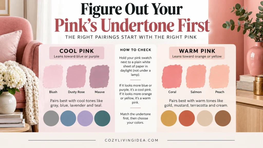
You do not have to match warm colors only with warm pinks or cool colors only with cool pinks. Similar undertones tend to create a more blended palette, while contrasting undertones can create more energy. The useful question is whether that contrast looks intentional beside the room’s flooring, furniture, wood and lighting.
Lighting can change which undertones become noticeable, so compare your pink with the other finishes in the room under both natural and artificial light. Sherwin-Williams similarly recommends comparing colors together and checking how different lighting conditions affect their undertones.
Test any pairing at three times of day — morning, midday, and evening — before committing. Pink is one of the most light-reactive colors in a home, and a combination that looks balanced at noon can read very differently under warm evening bulbs.
Complementary Colors That Go With Pink (The Color Wheel, Simplified)
Pink belongs broadly to the red-to-magenta family, which is why greens create such a natural contrast with many pinks. On a traditional decorating color wheel, green is the main complementary family to consider—but the exact green depends on the exact pink.
A soft blush may pair comfortably with sage or gray-green, while a stronger raspberry or magenta can handle a deeper, clearer green. A warmer coral-pink may also work beautifully with blue-green or teal.
Think of the color wheel as a starting point rather than a guarantee. The final combination still depends on saturation, value, undertone, surrounding materials and lighting.
Analogous colors such as purple, red-orange and peach sit closer to pink’s color family and generally create a more blended palette.
Neutrals such as white, cream, beige, taupe, gray, brown and black can give pink visual breathing room, but they are not completely undertone-free. A warm cream and a cool white can produce noticeably different results beside the same pink.
Beyond true complements, two other relationships matter for decorating:
- ✓
Analogous colors sit next to pink on the wheel — think purple and orange. These create a softer, more blended look than a complementary pairing.
- ✓
Neutrals (white, gray, beige, black) don’t appear on the color wheel at all, which is exactly why they go with every shade of pink without exception. This is why so many rental-friendly palettes lean on neutrals as the “safe” base and use pink as the accent.
The Best Colors That Go With Pink, At a Glance
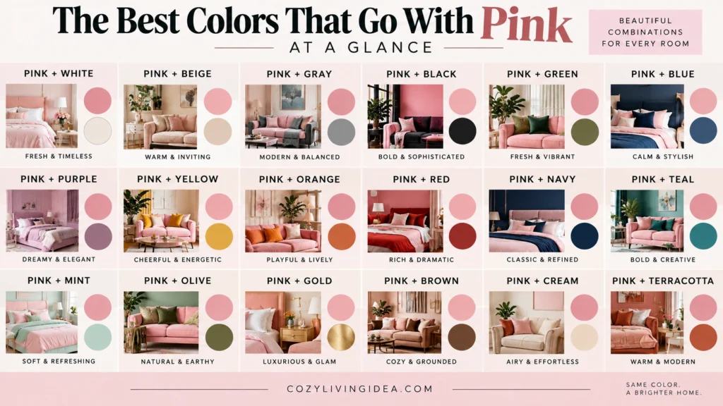
If you only take one thing from this article, take this list. These are the best colors that go with pink across the widest range of pink shades, styles, and budgets — the combinations that show up again and again in real, lived-in rooms rather than just staged photos:
- ✓
Sage or emerald green — the true complement, works with almost every pink
- ✓
Navy or dusty blue — calming, grown-up, never nursery-coded
- ✓
Warm cream or off-white — the easiest neutral pairing there is
- ✓
Charcoal or soft black — adds grounding contrast without harshness
- ✓
Mustard or gold — warms up cool pinks and adds richness
- ✓
Greige or warm gray — softens pink without competing with it
- ✓
Terracotta or burnt orange — an unexpected but genuinely good pairing for warm pinks
- ✓
Lavender or mauve — a gentle, tonal option for cool pinks
Good colors that go with pink don’t have to be complicated. What actually separates a list that works from one that doesn’t is contrast level — pairing a pale pink with an equally pale partner tends to disappear into itself, while pairing it with at least one color that’s noticeably darker or more saturated gives the eye something to land on. Keep that rule in mind as you go through the pairings below.
25 Best Colors That Go With Pink – Stylish Pairings for Every Room
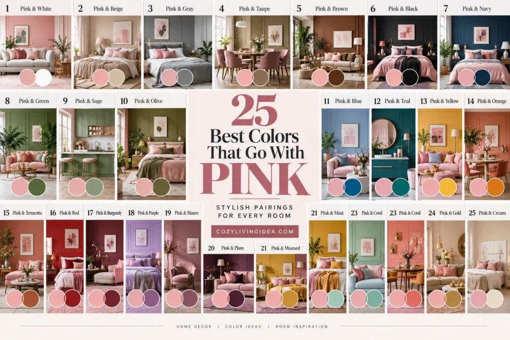
If you came here looking for colors that go with pink and white, colors that go with pink and green, or colors that go with pink and blue, they’re all below — along with colors that go with pink and purple, colors that go with pink and yellow, colors that go with pink and orange, and colors that go with pink and black, broken down one at a time.
1. Pink and White
This is one of the most searched colors that go with pink and white, and it never goes out of style, because white does for pink what it does for almost every color — it clears the palette and lets the pink do the talking. Crisp white against blush feels fresh and clean; white against hot pink feels bold and graphic; white against dusty rose feels soft and a little vintage.
Best pairings: Blush + crisp white · Dusty rose + warm white · Hot pink + white Works well for: Bedrooms, bathrooms, small spaces, nurseries
2. Pink and Cream
Cream is what you reach for when white feels too stark or too clinical for the room. It carries just enough warmth to soften pink without competing with it, which is why it shows up so often in cozier, more lived-in spaces.
Best combinations: Blush + ivory · Dusty rose + cream · Coral + warm cream Ideal for: Bedrooms, living rooms, reading nooks, traditional interiors
3. Pink and Beige
Beige brings the same warming effect as cream, but with a more grounded, natural feel — linen curtains and woven rugs rather than crisp bedding. It pulls out pink’s warmer undertones, which makes it a strong match for coral or salmon.
Bring this pairing in through beige sofas, natural-fiber rugs, linen curtains, or a pink accent chair against a beige backdrop. Best with: Coral, salmon, blush, dusty rose
4. Pink and Greige
Greige (a gray-beige hybrid) is the quiet workhorse of this whole list. It’s neutral enough to pair with almost any pink you own, which makes it the safest possible base if you’re not fully sure which pink shade you’ll end up with.
Best with: Nearly all pinks, from pale blush to bold fuchsia Works well for: Rentals, walls you can’t repaint, furniture-first decorating
5. Pink and Taupe
Taupe sits a shade deeper than beige and greige, closer to gray with a hint of brown. It works as a grounding neutral for a warmer, more sophisticated pink palette — think dusty rose walls with taupe furniture instead of stark white trim.
Best with: Dusty rose, mauve, muted blush
6. Pink and Chocolate Brown
Of all the neutrals here, chocolate brown adds the most real depth. It shows up especially well through furniture, picture frames, or a leather accent chair against blush or dusty pink, and it keeps a pink room from feeling overly sweet.
Best with: Blush, dusty rose, muted pink
7. Pink and Sage Green
Pink and green belong to complementary color families, which is why the pairing often creates noticeable but balanced contrast. Sage softens that relationship because its muted, gray-green quality reduces the intensity of the contrast, making it particularly easy to combine with blush and dusty rose. Benjamin Moore also recommends looking toward the green family when choosing complementary colors for pink.
Best with: Blush, dusty rose, pale pink
8. Pink and Olive Green
Olive pushes the same complementary idea into earthier, more grounded territory. It works especially well with warmer pinks like coral or terracotta-pink, since both colors share a similar depth and warmth.
Best with: Coral, terracotta-pink, salmon
9. Pink and Emerald Green
This is the highest-contrast, most jewel-toned green on the list, and one of the clearest complementary colors that go with pink you can pick. It’s a strong choice for a single accent piece — a velvet chair, a lamp — rather than a full wall, since two saturated colors together can start to compete for attention.
Best with: Hot pink, fuchsia, magenta
10. Pink and Forest Green
Forest green pairs beautifully with deeper, dustier pinks like rose or berry for a moodier, more autumnal feel than a spring-fresh sage combination.
Best with: Rose, berry pink, mauve
11. Pink and Navy
Navy is the anchor of the whole blue family here. It grounds pink without competing with it, largely because navy reads almost like a dark neutral rather than a true saturated blue — which is exactly why colors that go with pink and blue so often start with this combination.
Best pairings: Blush + navy · Salmon + navy · Hot pink + navy for a bolder look Works well for: Living rooms, kids’ rooms that need to grow up, home offices
12. Pink and Dusty Blue
This creates one of the softest, most romantic pairings on this entire list — both colors are already desaturated, so nothing fights for attention. It’s the pairing to use in a bedroom where you want calm over drama.
Best with: Blush, pale pink, ballet pink
13. Pink and Teal
Teal splits the difference between blue and green, so it carries some of the same complementary energy as pink and green while reading a little cooler and more contemporary.
Best with: Coral, hot pink, salmon
14. Pink and Denim Blue
A mid-tone, slightly faded blue, denim works particularly well with warmer pinks like salmon, giving a relaxed, almost coastal feel rather than a formal one.
Best with: Salmon, coral, warm blush
If blue is becoming a major part of the palette rather than just a small accent, our Colors That Go With Blue guide compares 15 partner colors across navy, dusty blue, cobalt, teal and other blue shades.
15. Pink and Lavender
Because pink and purple sit next to each other on the wheel, this is an analogous pairing rather than a complementary one — which is exactly why colors that go with pink and purple tend to feel soft and blended instead of high-contrast. Lavender is the gentlest version, and works best with equally soft, cool pinks. The two together can read as calm to the point of flat, so break it up with a neutral like white or gray.
Best with: Blush, ballet pink, pale pink
16. Pink and Mauve
Mauve (a dusty, brownish pink-purple) is less a pairing than a bridge color — it makes the jump between pink and purple feel intentional instead of accidental.
Best with: Dusty rose, muted blush
17. Pink and Plum
Plum or deep eggplant adds real depth and works surprisingly well as a grounding dark color for pink, similar to how navy or charcoal function, but with more inherent warmth.
Best with: Blush, mauve, dusty rose
18. Pink and Mustard
This is one of the more energetic combinations on the list, and it tends to work best when you let one color lead and the other support rather than using both at full strength. Mustard is deeper and more muted than a true yellow, which reads as sophisticated rather than childish next to pink — an especially strong match for warmer, coral-leaning shades.
Best with: Coral, salmon, terracotta-pink
19. Pink and Butter Yellow
This is the soft version of the same idea — closer in saturation to blush or pastel pink, so colors that go with pink and yellow feel gentle and spring-like here rather than bold.
Best with: Blush, pastel pink, ballet pink
20. Pink and Gold
As an accent rather than a full color block, gold adds warmth and a bit of shine without the boldness of a mustard wall. Brass hardware, picture frames, or a lamp base all do the job, and it works across nearly every pink shade.
Best with: Almost any pink, from pale blush to hot pink
21. Pink and Terracotta
Most people don’t think to try this one, but it genuinely works — pink is essentially a tint of red, and orange sits right next to red on the wheel, so the combination feels related rather than random. Terracotta is the most versatile option in the whole orange family: its warm, clay-like tone pairs naturally with coral or salmon for an earthy, sun-baked palette.
Best with: Coral, salmon, warm blush
22. Pink and Burnt Orange
Bolder and deeper than terracotta, burnt orange grounds a pink space the same way navy or charcoal would, just with more inherent warmth. It’s a strong choice for autumn-leaning decor that isn’t overtly seasonal.
Best with: Coral, terracotta-pink
23. Pink and Peach
Peach is the closest relative to pink on this entire list, so pairing the two creates a tonal, low-contrast look similar to pink and lavender above — good for a soft, cohesive palette rather than a statement one.
Best with: Blush, coral, salmon
24. Pink and Black
Of every combination here, colors that go with pink and black create the most dramatic, highest-contrast result — the pairing to reach for when you want pink to look intentional and grown-up rather than soft or sweet. It works best in small, deliberate doses: a black-framed mirror, matte black hardware, a single black accent chair. Because the contrast is so strong, a little goes a long way.
Best with: Blush, dusty rose, hot pink
25. Pink and Charcoal
Charcoal is the gentler version of the same idea. It gives you nearly the same grounding effect as black without the starkness, which makes it easier to live with day to day rather than reserving it for a single statement piece.
Best with: Almost any pink shade
Best Colors for Different Shades of Pink
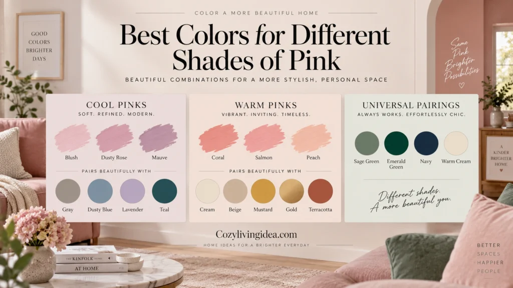
Not every pink asks for the same partner. If you already know exactly which pink you’re working with, this shortcuts the search.
Colors That Go With Blush Pink
White, cream, sage, dusty blue, lavender, gray, gold, greige
Colors That Go With Hot Pink
White, black, emerald green, navy, teal, orange, gold
Colors That Go With Dusty Rose
Cream, sage, mauve, taupe, charcoal, plum, olive
Colors That Go With Coral Pink
Terracotta, olive, teal, beige, mustard, denim blue
Colors That Go With Mauve Pink
Plum, taupe, dusty blue, charcoal, greige
Metallics and Natural Materials That Pair Well With Pink
Paint and fabric aren’t the only way to build good colors that go with pink into a room — metals and natural materials do a lot of the same work.
Pink and Brass
Brass warms up almost any pink, especially cooler or more muted shades. Bring it in through lighting, hardware, mirror frames, or small decorative objects. Best for: Blush, dusty rose, mauve
Pink and Rose Gold
A softer, pinker metal than standard gold, rose gold is the most literal metallic match on this list and creates a coordinated, slightly glamorous look with almost no risk of clashing. Best for: Blush, ballet pink, pale pink
Pink and Natural Wood
- ✓
Light oak + pink — fresh and airy
- ✓
Walnut + pink — warm and grounded
- ✓
Rattan + pink — relaxed, boho-leaning
- ✓
Dark wood + hot pink — bold and a little dramatic
How to Choose the Right Color to Pair With Pink
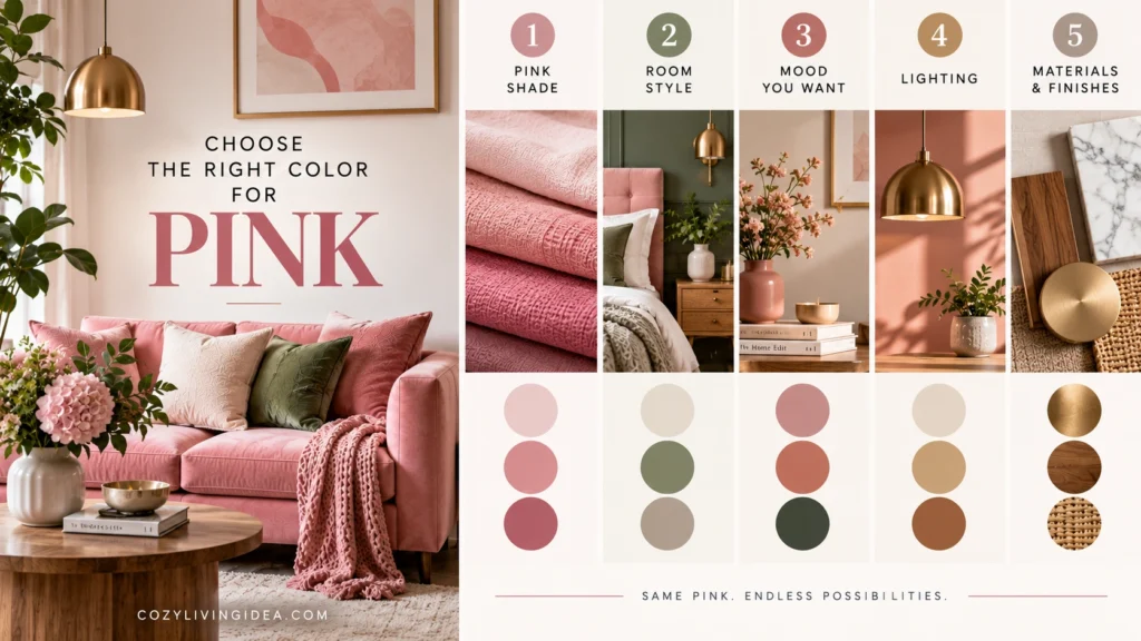
Figure Out Your Pink’s Undertone
Before picking a partner color, know which pink you’re working with. Hold your swatch or fabric sample next to a plain white sheet of paper in daylight, not under a lamp. If it leans toward blue or purple, it’s a cool pink — blush, dusty rose, mauve. If it leans toward orange or yellow, it’s a warm pink — coral, salmon, peach. Cool pinks pair naturally with other cool tones; warm pinks pull the best results from warm partners. You can mix temperatures on purpose for more contrast, but it helps to know you’re doing it deliberately.
Decide Whether You Want Contrast or Calm
For a calm palette, stay with cream, sage, dusty blue, or gray. For stronger contrast, bring in emerald green, navy, mustard, or black.
Balance Cool Pink With Warm Materials
Wood, brass, terracotta, and warm textiles keep a cool, blush-leaning pink room from tipping into feeling flat or cold, especially useful if your pink leans more mauve or icy than warm.
If you’re trying to carry the same palette beyond one room, our home inspiration ideas guide shows how to keep colors and materials connected across the whole home.
How to Build the Palette: The 60-30-10 Rule
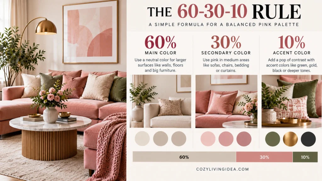
Once you’ve picked which colors that go with pink you actually like, the next problem is proportion — how much of each color to actually use so the room feels balanced instead of chaotic. Interior designers lean on a simple ratio for this: 60% dominant color, 30% secondary color, 10% accent color.
Applied to a pink palette, it usually breaks down like this:
- ✓
60% — your neutral base This is your walls, largest furniture piece, or flooring: white, beige, greige, or a soft gray.
- ✓
30% — your pink This is where the color actually gets to show up in a meaningful way: an accent wall, a sofa, bedding, curtains.
- ✓
10% — your contrast color This is your green, navy, mustard, terracotta, or black — used in smaller doses like pillows, artwork, a lamp, or hardware.
If you’re unsure how much of each color to use, 60-30-10 can provide a useful starting hierarchy: one color carries most of the visual weight, a second plays a noticeable supporting role, and a third appears in smaller accents.
The useful part is the hierarchy—not which color gets a specific percentage. A neutral rental might use cream as the dominant color and pink as the secondary color, while a bolder room could make pink the dominant wall color. Adjust the proportions to the room and the effect you want.
Common Mistakes to Avoid
Even with a solid list of colors that go with pink in hand, a few habits tend to trip people up more than the color choice itself.
Ignoring undertone entirely. This is the single most common issue. A cool blush next to a warm gold can look slightly muddy even though both colors are individually “good colors that go with pink” on paper — they just don’t share the same temperature. When a pairing looks off in person despite matching everything you’ve read, undertone mismatch is almost always the reason.
Matching saturation levels too closely. Two soft, pastel colors next to each other can flatten a room instead of complementing it, since there’s nothing for the eye to focus on. If your pink is soft, let at least one partner color be more saturated or dark to create contrast; if your pink is bold, a softer partner will balance it instead of competing.
Testing swatches under artificial light only. Paint chips and fabric swatches read differently under LED bulbs, warm incandescent light, and daylight. A pairing that looks perfect in a store aisle can shift noticeably once it’s on your actual wall.
Going 50/50 with two bold colors. This shows up most with pink-and-yellow and pink-and-orange pairings specifically. Two high-energy colors at equal strength rarely feel calm, even if each one individually works. Let one lead and the other support.
Forgetting neutrals need undertones too. Not all white is the same white. A cool-toned white can clash with a warm pink the same way a wrong color would, so treat your “neutral” the same way you’d treat any other color in the pairing.
Room-by-Room: Where Each Pairing Works Best
Different rooms ask different things of a pink palette, especially in a rental where you’re often working around existing white walls, laminate counters, or builder-grade fixtures you can’t change.
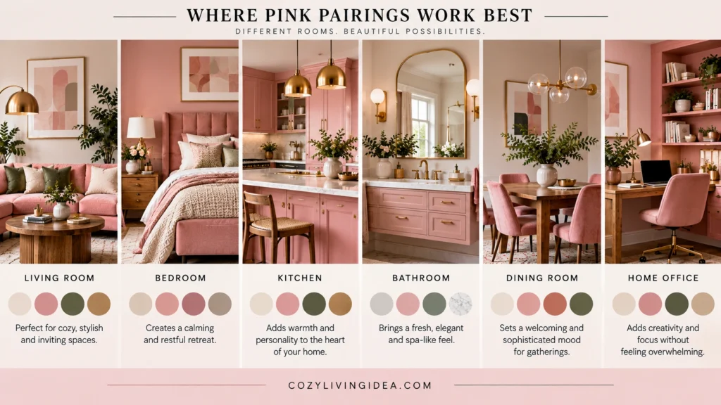
Bedroom: Soft pink with cream, sage, dusty blue or lavender creates a lower-contrast palette, while deeper pink with navy, plum or chocolate brown can produce a moodier bedroom. Choose the contrast level based on the atmosphere you want rather than assuming bedrooms must stay pale.
Living room: Living rooms give you room to use pink at several scales—from one chair or rug to a sofa or full wall. Navy, charcoal, green, brown and terracotta can all provide contrast depending on the pink.
Kitchen: In a rental, pink is often easiest to introduce through movable accessories such as runners, stools, artwork or textiles. In an owned kitchen, it can also appear through walls, cabinetry or tile when those permanent choices suit the rest of the finishes.
Small spaces and shared rentals: Lean hardest on the neutral pairings (white, cream, greige) as your base, then bring in your real color choice — green, blue, mustard, whatever you actually love — through removable elements: pillows, a rug, curtain panels, or peel-and-stick accents you can take with you when you move.
How to Test a Pink Color Combination Before Committing
Start with the finishes that aren’t changing: flooring, countertops, large furniture, cabinetry or existing wall color. Place your pink sample beside those materials first rather than evaluating it on its own.
Next, compare two or three versions of the partner color you’re considering. A sage that works beautifully with one dusty pink may look too yellow beside another; similarly, warm white and cool white can create very different results with the same blush.
Check the samples in morning daylight, afternoon light and after your normal lamps are switched on. Natural and artificial lighting can reveal undertones that were barely noticeable in a store or on a screen.
Before making a large commitment, introduce the new combination through one reversible element—a pillow cover, throw, curtain sample, artwork or removable accessory. If the pairing still looks right throughout the day, then consider using it on a larger painted or upholstered surface.
Final Thoughts
Colors that go with pink aren’t a fixed list so much as a set of relationships — undertone to undertone, saturation to saturation, dominant color to accent color. Once you know whether your pink runs warm or cool, and you’ve picked a contrast level that actually suits how the room gets used, almost every pairing on this list becomes a safe bet rather than a gamble.
Start small if you’re not sure: a single pillow, a bundle of greenery, or one terracotta vase will tell you more about whether a pairing works in your actual light than any swatch ever will.